.png)
10 Landing Page Optimization Best Practices to Boost Conversions in 2025
- Jason Wojo
- Dec 16, 2025
- 21 min read

Driving paid traffic to a landing page is only half the battle. The real challenge, and where most businesses falter, is converting those expensive clicks into tangible results like leads, sales, or sign-ups. A poorly optimized page doesn't just waste ad spend; it bleeds potential revenue, turning a promising campaign into a costly dead end. This is precisely why mastering landing page optimization best practices is no longer optional. It's a critical pillar of profitable growth for any business leveraging paid advertising.
Forget generic advice and vague theories. This guide moves directly into the actionable strategies that deliver measurable improvements. We will dive deep into a comprehensive blueprint of 10 proven, data-backed practices designed to transform your landing pages from passive online brochures into powerful conversion engines. Each point is crafted to be immediately applicable, helping you systematically eliminate friction, build trust, and guide visitors toward your desired goal.
You will learn how to refine every critical element of your page, including:
Crafting headlines that grab attention and align with ad creative.
Designing Calls-to-Action (CTAs) that are impossible to ignore.
Integrating social proof to build instant credibility.
Streamlining forms to maximize lead capture without friction.
Optimizing for mobile users and lightning-fast page speeds.
Whether you're an e-commerce brand scaling with paid social, a local service business seeking qualified leads, or a consultant aiming to grow client acquisition, these insights provide the framework for turning ad impressions into measurable ROI. Let’s get started.
1. Headline Optimization
Your headline is the digital equivalent of a first impression. It's often the single most-read element on your landing page and determines whether a visitor, arriving from a paid ad, will stay to learn more or bounce within seconds. A powerful headline immediately communicates your unique value proposition (UVP), resonates with the visitor's pain point, and creates a compelling reason to continue engaging with your content.
An effective headline acts as a promise, directly aligning with the ad copy that brought the user to your page. This "message match" is critical for building trust and reducing cognitive dissonance. If a user clicks an ad promising "50% Off Custom Home Services," the landing page headline must echo that offer clearly. This is a foundational element of landing page optimization best practices, as it sets the stage for the entire user journey.

Actionable Tips for Headline Optimization
Implementing this best practice involves a strategic and data-driven approach. It's not about guessing what works; it's about testing and refining to discover what resonates most with your target audience, whether they're e-commerce shoppers or local service leads.
Focus on Benefits, Not Features: Your visitor cares about what your product or service can do for them. Instead of "Advanced AI-Powered Software," try a headline like "Automate Your Marketing in 10 Minutes."
Use Numbers and Specificity: Quantifiable data makes your claims more credible and tangible. For example, "Join Over 10,000 Satisfied Clients" is more powerful than "Join Our Community."
Test Different Angles: Continuously A/B test headline variations. Pit a question-based headline against a benefit-driven one, or a direct statement against a social-proof-focused headline.
Keep it Concise for Mobile: Aim for headlines under 10 words or 60 characters to ensure they are fully visible on mobile devices without wrapping awkwardly.
Match Headline to Ad Copy: Ensure your headline perfectly aligns with the promise made in your PPC, social, or email campaign. This consistency is key for maximizing conversion rates.
Key Insight: According to legendary copywriter David Ogilvy, "On the average, five times as many people read the headline as read the body copy. When you have written your headline, you have spent eighty cents out of your dollar."
Leading brands excel at this. Unbounce, a leader in landing page software, uses clear, benefit-oriented headlines like "Build, Test & Optimize Landing Pages in Minutes," which directly addresses the user's need for speed and efficiency. Similarly, a tax advisor might test "Cut Your Tax Bill by 30% This Year" to grab immediate attention from qualified prospects.
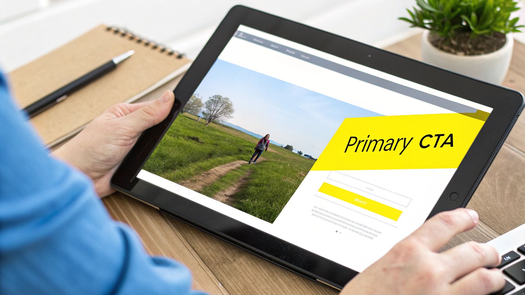
2. Clear Call-to-Action (CTA) Placement and Design
Your Call-to-Action (CTA) is the gatekeeper to your conversion goal. It's the button, link, or instruction that tells visitors exactly what to do next. An effective CTA isn't just a button; it's a clear, compelling, and visually distinct directive that bridges the gap between user interest and user action, making it a cornerstone of landing page optimization best practices.
A well-designed CTA removes ambiguity and reduces friction, guiding the user's eye and motivating them to take the desired step, whether that's signing up for a free trial, booking a consultation, or making a purchase. It acts as the logical conclusion to the promise made by your headline and body copy, transforming passive readers from a paid campaign into active, qualified leads.
Actionable Tips for CTA Optimization
Optimizing your CTA involves a thoughtful combination of design psychology, persuasive copywriting, and strategic placement. It's about making the next step so obvious and appealing that the user feels confident clicking through, whether they're on a desktop or mobile device.
Use Contrasting Colors: Your CTA button must stand out from the page's background. Use a color that contrasts with your brand palette, such as a bright green, orange, or blue, to draw immediate attention.
Employ Action-Oriented Copy: Replace generic words like "Submit" or "Click Here" with value-driven commands. "Start My Free Trial" or "Get My Free Quote" clearly communicates the benefit the user will receive.
Place it Above the Fold: Your primary CTA should be visible without scrolling. For longer pages, repeat the CTA multiple times to capture users as their interest peaks further down the page. For a deeper dive into the practical aspects of designing interactive elements, consider learning more about optimizing button design for Calls-to-Action.
Add Reassuring Micro-Copy: Reduce anxiety by adding small text near the CTA. Phrases like "No credit card required" or "Join 10,000+ happy customers" can significantly lift conversion rates by addressing last-minute hesitations.
Test Size and Shape: A larger button can grab more attention, but it's crucial to test what works for your design. Ensure the button is large enough to be easily tapped on mobile devices.
Key Insight: According to research by Unbounce, changing just one word in a CTA button can result in a 90% increase in click-through rate. The language you use has a direct and significant impact on performance.
Industry leaders demonstrate this principle effectively. Spotify uses a prominent, high-contrast green button with the compelling copy "Get Spotify Free" to drive sign-ups. Similarly, Dropbox uses a clean blue CTA with the specific and low-commitment text "Get started for free," guiding users toward their core conversion action with clarity and confidence.
3. Form Optimization and Field Reduction
Your form is the final gateway to a conversion, but it's also the most common point of friction. Every field you ask a visitor to fill out adds to their cognitive load and introduces another opportunity for them to abandon the process. Effective form optimization is about removing every unnecessary barrier, making the submission process as seamless and painless as possible.
The core principle here is to only ask for the information you absolutely need at that specific moment. Research consistently shows a direct correlation between the number of form fields and the abandonment rate; each additional field can decrease conversions significantly. This is a critical aspect of landing page optimization best practices because a poorly designed form can negate all the hard work you put into your headline, copy, and design, sabotaging your campaign's ROI.

Actionable Tips for Form Optimization
Implementing this best practice requires a ruthless audit of your data collection process. It's about balancing your marketing team's desire for data with the user's desire for a quick, effortless experience. Whether you're generating leads for a real estate agency or selling a high-ticket course, a streamlined form is non-negotiable.
Conduct a Form Field Audit: Review every field and ask, "Is this information essential to qualify or contact this lead right now?" Eliminate anything that can be gathered later.
Embrace Progressive Profiling: Use tools like HubSpot or Marketo to ask for information incrementally. On the first conversion, ask for a name and email. On their next visit, ask for their company name.
Reduce Perceived Complexity: Use single-column layouts, which are easier for users to scan and complete. For longer forms, break them into multiple steps with a progress bar.
Implement Smart Defaults: Use auto-fill capabilities and pre-populate fields with known information for returning visitors to minimize manual entry.
Test Field Removal: A/B test your form by removing one field at a time (e.g., "Phone Number") to measure the direct impact on your conversion rate.
Key Insight: A study by HubSpot analyzing over 40,000 landing pages found that reducing the number of form fields from four to three can increase conversions by nearly 50%.
Brands like Typeform have built their entire product around this principle, using a one-question-at-a-time interface that dramatically reduces psychological friction. Similarly, Intercom often uses minimalist chatbot forms that ask for an email first, creating a low-commitment entry point before requesting more details.
4. Value Proposition and Social Proof Integration
Visitors arriving on your landing page have one primary question: "What's in it for me, and why should I trust you?" Answering this immediately is non-negotiable. Integrating a clear value proposition with compelling social proof addresses both parts of this question, building instant credibility and reducing the inherent friction and anxiety associated with a new purchase or lead submission.
Your Unique Value Proposition (UVP) articulates the specific benefit you provide and how you are uniquely better than the alternatives. Social proof, such as testimonials, reviews, or partner logos, serves as the evidence that validates your claims. The synergy between these two elements is a cornerstone of modern landing page optimization best practices, transforming a simple claim into a believable promise and significantly boosting visitor confidence.
Actionable Tips for Integrating Value Proposition and Social Proof
Effectively weaving social proof into your value proposition requires more than just adding a random testimonial. It's about strategically placing credible evidence where it will have the most impact, supporting your key marketing messages for audiences ranging from local service leads to e-commerce buyers.
Be Specific and Quantifiable: Vague praise is forgettable. Instead of "Great service," use a testimonial that says, "Their team helped us increase qualified leads by 45% in just 60 days."
Use Authentic Customer Details: Include real names, photos, and company names (with permission) alongside testimonials. Authenticity builds a powerful connection and makes the proof more relatable.
Show, Don't Just Tell: Display logos of well-known clients or partners prominently. Trust badges from security firms (like Norton or McAfee) or industry associations also add a layer of credibility.
Feature Diverse Use Cases: If you serve multiple segments, like real estate agents and tax advisors, showcase testimonials from each group to demonstrate broad appeal and relevance.
Leverage Video Testimonials: A short, authentic video of a happy customer can be far more persuasive than text alone, as it conveys emotion and sincerity more effectively.
Key Insight: According to research popularized by psychologist Robert Cialdini, social proof is one of the six key principles of persuasion. When people are uncertain, they will look to the actions and behaviors of others to determine their own.
Salesforce is a master of this, prominently featuring customer logos and detailed case studies with specific ROI metrics. Similarly, Airbnb builds trust for every listing by integrating user-generated photos and transparent review ratings, allowing social proof to be the core of its value proposition.
5. Mobile Optimization and Responsive Design
In an era where over half of all web traffic originates from mobile devices, a mobile-first approach is no longer optional; it’s fundamental. Your landing page must provide a seamless, intuitive experience on a smartphone, or you risk losing a significant portion of your paid traffic. Mobile optimization ensures your page loads quickly, is easy to navigate with a thumb, and presents your core message and call-to-action clearly on a small screen.
This practice is a cornerstone of modern landing page optimization best practices because it directly impacts both user experience and your bottom line. A clunky, slow, or hard-to-read mobile page leads to high bounce rates, wasted ad spend, and a poor brand perception. Google’s mobile-first indexing also means that your mobile site's performance can directly influence your search engine visibility, making it critical for both paid and organic success.
Actionable Tips for Mobile Optimization
Ensuring your landing page is perfectly tailored for mobile users involves a specific set of technical and design considerations. It’s about more than just making things smaller; it’s about rethinking the user journey for a touch-based interface.
Adopt a Mobile-First Design: Design the mobile experience first, then adapt it for desktop. This forces you to prioritize essential content and create a lean, focused layout from the start.
Compress and Optimize Images: Use modern image formats like WebP and implement responsive images with the attribute to serve appropriately sized files based on the user's device, drastically reducing load times.
Ensure Touch-Friendly Elements: Make sure buttons, links, and form fields are large enough to be easily tapped. Implement ample spacing between interactive elements to prevent accidental clicks.
Simplify Navigation and Forms: Use collapsible menus (hamburger menus) and design shorter, single-column forms with large input fields to make completion on mobile effortless.
Test on Real Devices: While browser emulation is useful, nothing beats testing your page on actual iOS and Android devices to identify real-world usability issues with scrolling, tapping, and rendering.
Key Insight: According to Google, 53% of mobile site visitors will leave a page that takes longer than three seconds to load. Every second of delay directly correlates with a drop in conversions, making speed a primary goal of mobile optimization.
Industry leaders demonstrate this masterfully. Airbnb provides a clean, image-forward mobile experience that makes booking simple and intuitive. Similarly, Stripe maintains its sleek, professional design on mobile, ensuring that all core functionalities remain accessible without clutter, proving that a high-converting desktop page can be effectively translated to mobile without sacrificing performance or usability.
6. A/B Testing and Data-Driven Iteration
Even with a deep understanding of your audience, optimization is not a one-time task; it's a continuous process of refinement. A/B testing, also known as split testing, is the disciplined methodology for making these refinements. It involves creating a variation of your landing page (or a specific element) and showing it to a portion of your traffic, while the original (the "control") is shown to the other portion. This data-driven approach removes guesswork and allows you to make decisions based on actual user behavior, not assumptions.
This systematic process is the engine behind all high-performing landing pages. Without it, changes are based on intuition, which can easily lead to a decrease in conversions. A/B testing is a foundational practice because it provides empirical evidence of what resonates most with your audience, whether it's a different call-to-action, a new headline, or a simplified form layout. It turns your landing page into a living asset that continually evolves to maximize performance.
Actionable Tips for A/B Testing
Implementing a successful testing program requires more than just launching a variant; it demands a structured approach to ensure your results are valid and lead to meaningful improvements for your paid campaigns.
Prioritize High-Impact Elements: Start by testing elements that have the biggest potential impact on conversion rates, such as your headline, CTA button copy and color, hero image, and form length.
Test One Variable at a Time: In a true A/B test, you should only change one element between the control and the variation. This allows you to attribute any change in performance directly to that specific element.
Ensure Statistical Significance: Run your test long enough to gather sufficient data and reach a statistical significance of at least 95%. Tools like Optimizely and VWO have built-in calculators for this.
Formulate a Clear Hypothesis: Before launching a test, document your hypothesis. For example: "Changing the CTA button text from 'Submit' to 'Get My Free Quote' will increase form submissions because it is more specific and value-oriented."
Run Tests for Full Business Cycles: Let tests run for at least one to two full weeks to account for fluctuations in user behavior on different days of the week.
Key Insight: According to a VWO report, only one out of every seven A/B tests produces a winning result. This highlights the importance of continuous testing; most ideas will fail, but the ones that succeed can deliver significant uplifts in conversions.
Companies like ConvertKit are masters of this, constantly running multivariate tests on their opt-in forms to find the perfect combination of fields, copy, and design. Similarly, a local home service business could test a "Request a Quote Now" button against a "Schedule a Free Consultation" button to see which offer generates more qualified leads.
7. Page Speed Optimization and Performance
In the world of paid advertising, every second counts. Page speed isn't just a technical metric; it's a direct driver of conversion rates and ad spend efficiency. A slow-loading landing page is a leading cause of high bounce rates, as users arriving from a fast-paced ad environment have little patience for delays. A fast, responsive page, however, maintains the momentum from the ad click, delivering a seamless user experience that encourages conversions.
Optimizing for speed directly impacts your bottom line and is a cornerstone of landing page optimization best practices. Research consistently shows a strong correlation between faster load times and higher conversion rates. For businesses investing in PPC campaigns, this means a lower cost-per-acquisition and a higher return on ad spend. Google also uses page experience signals, including Core Web Vitals, in its ad quality calculations, meaning faster pages can lead to better ad placements at a lower cost.
Actionable Tips for Page Speed Optimization
Improving your landing page performance involves a series of targeted technical adjustments. These changes reduce the amount of data a browser needs to download and render, resulting in a near-instantaneous experience for the visitor.
Compress and Optimize Images: Use tools to reduce image file sizes without sacrificing quality. Convert images to modern formats like WebP, which offers superior compression compared to JPEG or PNG.
Leverage Browser Caching: Configure your server to tell browsers to store static files (like CSS, JavaScript, and images) locally. This dramatically speeds up load times for repeat visitors.
Utilize a Content Delivery Network (CDN): A CDN stores copies of your page on servers around the world, delivering content from the location closest to the user, which significantly reduces latency.
Minimize CSS and JavaScript: Remove unnecessary characters, comments, and spaces from your code files to make them smaller and faster to download.
Defer Non-Critical JavaScript: Ensure that essential, above-the-fold content loads first by deferring the loading of scripts that are not required for the initial page render.
Key Insight: According to Google, the probability of a mobile user bouncing increases by 32% as page load time goes from 1 second to 3 seconds. By 5 seconds, the probability increases by 90%.
Industry giants have quantified the impact of speed. Amazon famously reported that just 100 milliseconds of latency cost them 1% in sales, while Shopify found that a 1-second improvement in page speed could boost conversions by up to 2.4%. These figures underscore why top-tier advertisers and e-commerce brands treat page speed as a critical conversion metric, not just an IT task.
8. Compelling Copy and Messaging Strategy
Beyond a stellar headline, the body copy of your landing page is where persuasion happens. It's the narrative that bridges the gap between a visitor's problem and your solution. Compelling copy speaks directly to the target audience's deepest pain points, desires, and motivations, using a tone and language that resonates with them on a personal level. It transforms features into tangible benefits and builds an emotional connection that drives action.
An effective messaging strategy is a cornerstone of landing page optimization best practices because it works to preemptively answer questions and overcome objections. If a visitor from a paid ad campaign arrives with skepticism, your copy is the primary tool to build trust, demonstrate value, and guide them confidently toward the call-to-action. It's about making them feel understood and showing them a clear path to their desired outcome.
Actionable Tips for Compelling Copy
Crafting high-converting copy involves deep customer empathy and strategic messaging. This isn't just about writing well; it's about engineering a conversation that convinces and converts leads, whether for a local home service business or a national e-commerce brand.
Focus on the "So What?": For every feature you list, immediately explain the benefit. Instead of "We use high-tensile steel," write "You get a product that lasts a lifetime, guaranteed."
Address Objections Proactively: Identify the top 3-5 reasons someone might not convert (price, complexity, trust) and address them directly in your copy or an FAQ section.
Use the Voice of the Customer: Pull direct quotes, phrases, and pain points from customer interviews, surveys, and reviews. This ensures your messaging is authentic and relatable.
Create Urgency and Scarcity: Use phrases like "Limited spots available," "Offer ends Friday," or "Only 3 left in stock" to encourage immediate action.
Keep it Scannable: Use short paragraphs (2-3 sentences max), bold text for key phrases, and descriptive subheadings to guide the reader’s eye down the page.
Key Insight: According to legendary copywriter Eugene Schwartz, you must enter the conversation already happening in the customer's mind. Your copy shouldn't create a new desire but channel and direct an existing one.
Brands like Grammarly excel at this by focusing on the emotional benefit of confidence in writing, rather than just the technical feature of grammar checking. Similarly, the Dollar Shave Club built an empire with a simple, humorous, and benefit-driven copy strategy ("Our blades are f***ing great"), which spoke directly to consumers tired of overpriced razors.
9. Visual Design and User Experience (UX) Hierarchy
Your landing page's visual design is its silent salesperson. It guides a visitor's attention, communicates professionalism, and makes the journey toward conversion intuitive and frictionless. An effective visual and UX hierarchy uses elements like whitespace, contrast, typography, and color to create a clear path, ensuring the most important information, like your value proposition and call-to-action, stands out immediately.
Strong visual hierarchy is a core component of landing page optimization best practices because it prevents overwhelm and directs focus. When a user arrives from a paid ad, a clean, organized layout helps them quickly find the information they are looking for, reinforcing the promise of the ad and building confidence. A cluttered or confusing design, on the other hand, creates friction and can cause visitors to abandon the page before they even understand your offer.
Actionable Tips for Visual Design and UX Hierarchy
Implementing a strong visual hierarchy involves more than just aesthetics; it's a strategic process of arranging elements to guide user behavior. For businesses running paid ads, from e-commerce stores to local service providers, this means designing a page that logically funnels visitors toward a single conversion goal. A key strategy for enhancing the effectiveness of your landing pages is through robust web usability testing to boost UX conversions.
Use Whitespace Strategically: Generous whitespace (or negative space) around elements reduces clutter and helps key information, like your headline and CTA, stand out.
Create Hierarchy with Size and Scale: Make the most important elements, such as your headline, larger than less critical ones. This visual cue tells users where to look first.
Leverage Color and Contrast: Use a limited color palette (2-3 primary colors) and apply a bold, contrasting color exclusively for your CTA buttons to make them pop.
Ensure Accessibility: Adhere to WCAG AA guidelines for color contrast to ensure your page is readable for all users, including those with visual impairments.
Use High-Quality, Relevant Imagery: Your images and videos should directly support your value proposition and show your product or service in a compelling context.
Key Insight: "Good design is obvious. Great design is transparent." - Joe Sparano. The best landing page designs guide users so effortlessly that the user doesn't even notice the design itself, only the message.
Brands like Apple are masters of this, using minimalist design and abundant whitespace to focus attention on their product and key benefits. Similarly, a med spa could use a clean layout with high-quality before-and-after images and a brightly colored "Book Your Consultation" button to create a clear, compelling conversion path.
10. Personalization and Audience Segmentation
A one-size-fits-all landing page is a missed opportunity. Personalization and audience segmentation treat visitors as individuals, not a monolith, by delivering content tailored to their specific context, needs, and origin. This practice involves creating customized experiences using dynamic content based on attributes like referral source, geolocation, or past behavior, ensuring the message resonates far more deeply.
By segmenting your audience, you can create landing page variations that speak directly to different user groups. For instance, a visitor arriving from a LinkedIn ad (likely a professional) should see a different message than someone clicking from a TikTok ad (potentially a younger, consumer-focused demographic). This targeted approach is a cornerstone of advanced landing page optimization best practices because it dramatically increases relevance, which in turn boosts engagement and conversion rates.
Actionable Tips for Personalization and Segmentation
Implementing personalization doesn't have to be overly complex. You can start with broad segments and refine your approach over time to create highly relevant user journeys for e-commerce customers, local service leads, or consulting clients.
Start with Key Segments: Begin by identifying 2-3 primary audience segments. This could be based on traffic source (e.g., Google Ads vs. Facebook Ads), device type (mobile vs. desktop), or new vs. returning visitors.
Use Dynamic Text Replacement (DTR): Leverage DTR to automatically change keywords in your headline and copy to match the search term or ad a user clicked. This creates a seamless message match.
Personalize Based on Referral Source: Create unique landing page experiences for traffic coming from different platforms. The messaging for an email subscriber should be different from that for a first-time visitor from a PPC ad.
Implement Geographic Targeting: Tailor content, offers, and imagery based on the visitor's country, state, or city. A home service business, for example, can show location-specific testimonials.
Leverage UTM Parameters: Use UTM parameters in your campaign URLs to track which segments are performing best, allowing you to double down on what works and refine underperforming variations.
Key Insight: According to HubSpot, personalized calls-to-action (CTAs) that are tailored to the individual user perform 202% better than generic, non-personalized CTAs.
Leading platforms like HubSpot and Unbounce are pioneers in this area. They enable marketers to build landing pages where headlines, images, and CTAs change dynamically based on who is visiting. For example, a real estate agent could show images of family-friendly homes to visitors from a "family homes" ad campaign, while showing luxury condos to traffic from a "downtown living" campaign, all on the same URL.
Landing Page Best Practices: 10-Point Comparison
Item | 🔄 Implementation Complexity | ⚡ Resource Requirements | 📊 Expected Outcomes | 💡 Ideal Use Cases | ⭐ Key Advantages |
|---|---|---|---|---|---|
Headline Optimization | Low–Medium — quick copy iterations, audience insight needed | Low — copywriter + A/B tool | High impact on engagement; can sharply reduce bounce (benefit-focused ≈ +40%) | New landing pages, traffic-source-specific campaigns | Highest ROI element; rapid testability; immediate engagement boost |
Clear Call-to-Action (CTA) Placement and Design | Medium — design, placement testing, copy refinement | Low–Medium — designer, front-end dev, testing tool | Significant conversion uplift (specific CTAs ≈ +28%) | Signup funnels, trial/purchase CTAs, above-the-fold actions | Removes friction; clarifies next step; device-friendly |
Form Optimization and Field Reduction | Medium — UX changes, conditional logic/backend for profiling | Medium — dev, analytics, form platform | Measurable conversion gains; reducing fields (10→5) ≈ +25% | Lead capture, signups, gated content flows | Reduces abandonment; improves completion speed and UX |
Value Proposition & Social Proof Integration | Medium — content collection and placement, credibility checks | Medium — content, testimonials, design work | Strong trust lift; conversions can increase 20–50% with specific proof | High-consideration purchases, B2B, trust-sensitive offers | Builds credibility; reduces purchase hesitation with evidence |
Mobile Optimization & Responsive Design | High — multi-device design, performance tuning, extensive testing | High — designers, devs, testing on real devices | Reduces mobile bounce; improves SEO (mobile-first); >50% traffic mobile; 3s+ load loses ~53% | Mobile-first audiences, eCommerce, local search | Better UX and SEO; broader accessibility; improved engagement |
A/B Testing & Data-Driven Iteration | High — experiment design, statistical rigor, documentation | High — testing platform, analytics, traffic volume | Systematic lifts over time; typical program gains 20–50% across months | Prioritizing roadmap, validating high-impact changes | Removes guesswork; creates repeatable learning and buy-in |
Page Speed Optimization & Performance | High — technical front/back-end work, infrastructure changes | High — DevOps, CDN, performance tools | Direct conversion and SEO gains; 1s delay ≈ 7% conversion loss; users expect <2s | High-traffic sites, global audiences, eCommerce | Faster UX, lower bounce rates, reduced infrastructure costs |
Compelling Copy & Messaging Strategy | Medium — research-heavy, skilled copywriting required | Medium — copywriter, customer research, testing | Better relevance and conversions; benefit-focused ≈ +30–40% | Brand pages, storytelling, objection-heavy offers | Emotional connection; clearer value; preempts objections |
Visual Design & UX Hierarchy | Medium–High — design expertise, prototyping, usability testing | Medium — designers, UX research, assets | Improves usability and engagement; usability gains ≈ 30–50% | High-brand pages, complex product flows, landing pages | Guides attention; creates professional impression; boosts engagement |
Personalization & Audience Segmentation | High — data integration, dynamic content, variant management | High — marketing automation, dev, data/analytics | Significant relevance and conversion gains (≈ 20–50%) | Multi-audience campaigns, paid traffic, personalized recommendations | Higher relevance and ROI; tailored user journeys and messaging |
Activating Your Optimization Strategy for Predictable Growth
You've just navigated a comprehensive blueprint covering the most impactful landing page optimization best practices. We've deconstructed everything from crafting magnetic headlines and compelling copy to the critical nuances of mobile-first design, lightning-fast page speed, and strategic A/B testing. The journey through these ten pillars reveals a powerful truth: a high-converting landing page is not an accident. It is the deliberate result of a systematic, data-informed process.
These practices are not a checklist to be completed and forgotten. Instead, view them as the foundational elements of a continuous improvement engine for your business. The goal is to move beyond "hoping" your ads will work and into a state of predictable, scalable growth where every dollar spent on traffic has a clear, measurable, and optimized path to conversion. This is how you transform your paid advertising from an unpredictable expense into a reliable revenue-generating asset.
From Theory to Tangible Results: Your Next Steps
The sheer volume of optimization opportunities can feel overwhelming, but progress is made through focused, incremental action. Your objective is not to overhaul every landing page overnight but to build momentum by tackling the most significant friction points first.
Here is a practical, three-step framework to activate what you've learned:
Conduct a Quick Audit: Choose one of your most important landing pages, ideally one receiving significant paid traffic. Review it against the ten principles discussed. Where are the most glaring gaps? Is the headline misaligned with your ad copy? Is the CTA button difficult to find on mobile? Is your form demanding too much information upfront? Identify the top two or three most obvious areas for improvement.
Formulate a Hypothesis: Based on your audit, create a clear, testable hypothesis for each issue. For example: "By reducing the number of form fields from seven to three, we will increase lead submission rates because it will lower user friction." Or, "By adding a specific customer testimonial directly below the main CTA, we will increase conversions by boosting trust at the point of decision."
Launch Your First Test: Using your chosen A/B testing tool, implement the change on a variant version of your page. Let the test run until you achieve statistical significance, and allow the data to declare a winner. This single action is the most crucial step; it transitions you from a passive reader into an active optimizer.
The Core Philosophy: Empathy Backed by Data
While the technical details of page speed, responsive design, and tracking are essential, the heart of successful landing page optimization is a deep, empathetic understanding of your audience. Every element, from your value proposition to the visual hierarchy, must answer your visitor's core questions: "Am I in the right place? Does this solve my problem? Can I trust this brand? What should I do next?"
Mastering these landing page optimization best practices allows you to answer those questions with resounding clarity and confidence. You build a seamless bridge between a user's initial click and the final conversion, removing ambiguity and reinforcing value at every step. This relentless focus on the user experience, validated by rigorous testing and analytics, is what separates stagnant campaigns from those that achieve exponential, profitable scale. The journey starts not with a complete redesign, but with your very next A/B test.
Ready to turn your landing pages into a predictable growth engine but need an expert team to accelerate the process? Wojo Media specializes in bolting onto brands to implement these exact landing page optimization best practices, integrating them with data-driven ad strategies to scale profitably. Schedule a consultation with Wojo Media today to see how we can build your high-converting customer acquisition system.
Comments