.png)
A Guide To Improving Ecommerce Conversion Rates
- Jason Wojo
- Jan 5
- 17 min read

When people talk about improving their ecommerce conversion rates, what they’re really saying is they want to turn more of their website visitors into actual, paying customers. This isn't about finding a single magic button to press. It’s about building a cohesive strategy.
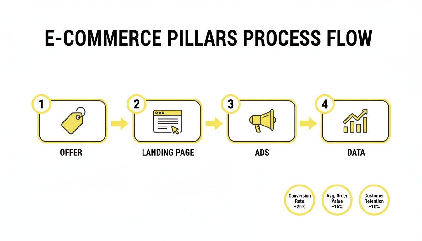
Your success boils down to how well you optimize four core pillars: your offer, your landing pages, your ads, and your data. If you let even one of these pillars crumble, you create a silent profit leak that sabotages all your other marketing efforts.
What Really Drives Ecommerce Conversion Rates
Too many ecommerce brands get stuck chasing a silver bullet. They hunt for that one hack or tactic they believe will double their sales overnight. A lot of them get fixated on industry benchmarks, aiming for that average conversion rate of 2-4% without really understanding what drives that number.
While benchmarks can give you a rough idea of where you stand, just hitting the average means you're leaving a ton of money on the table. The truth is, world-class brands don't just hit the average—they consistently blow past it by building a resilient, interconnected system.
A quick look at historical ecommerce benchmarks shows just how far we've come. Between 2000 and 2010, when online trust was shaky and websites were clunky, conversion rates barely scraped past 2.5%. The last decade saw that figure climb closer to 4.0% thanks to better user experiences and streamlined payment options. Today, the global average hovers between 2% and 4%, with the U.S. market sitting around 2.58%. You can check out a detailed history of these ecommerce benchmarks and insights on SpeedCommerce.
This evolution proves that just having a website isn’t enough anymore. Sustainable growth comes from a holistic approach, which brings us back to those four fundamental pillars.
The Four Pillars Of Conversion Rate Optimization
True conversion rate optimization isn't about running a bunch of random A/B tests and hoping for the best. It's a systematic process of strengthening the core components of your customer acquisition machine. A weak link in one area will absolutely drag the others down, turning your ad spend into a sunk cost.
To get significant and lasting results, you have to treat these four areas as interconnected parts of a single engine.
Pillar | What It Is | Why It Matters For Conversions |
|---|---|---|
The Offer | The heart of your business—what you sell, its price, and the core value proposition. | A weak or confusing offer simply won't convert, no matter how great your ads or landing page are. |
The Landing Pages | This is where the magic (or the bounce) happens. It must clearly communicate the offer and guide the user. | Your page has one job: build trust and push the visitor towards a single, clear call to action. |
The Ads | Your ads are the engine that drives traffic to your offer and landing pages. | They need to be compelling, hit the right audience, and perfectly match the messaging on your page. |
The Data | This is the feedback loop that tells you what’s actually working and what's a waste of money. | Without accurate tracking, you're just flying blind, unable to fix problems or lean into what works. |
When you master these four pillars, you stop guessing. You start building a predictable, repeatable system for turning clicks into customers.
This is how you ensure every dollar you pour into traffic has the highest possible chance of delivering a real return.
If you’re running on Shopify, it's worth digging into platform-specific tactics. Many of the principles discussed in guides on how to increase conversion rates on Shopify reinforce the importance of this comprehensive approach.
In the next sections, we’ll break down exactly how to audit, fix, and scale each of these four pillars to build your own high-converting ecommerce engine.
Finding The Leaks In Your Conversion Funnel
You can't fix what you don't measure. Forget about guesswork or randomly testing button colors; improving your e-commerce conversion rate is a systematic process of plugging the leaks where you lose your most valuable customers.
To do this, you have to become a data detective. You need to move past the surface-level vanity metrics and uncover the real story your numbers are trying to tell you.
Many store owners look at their overall conversion rate and either panic or get a false sense of security. But that single number is just an average—it completely hides the critical drop-off points that are quietly draining your profits. The real breakthroughs happen when you break the customer journey into distinct stages and see what’s happening at each step.
Is the problem an unconvincing landing page? Weak product descriptions? A clunky checkout? This is the only way to find out. A good conversion rate calculator can give you a solid baseline, but the real work starts when you dig into your own analytics.
Digging Into Quantitative Data
Your first stop is your analytics platform—think Google Analytics. This is where you'll find the hard numbers that point you directly toward the problem areas. Don't get overwhelmed. Just focus on the metrics that track the key actions a user takes on their path to buying something.
Start by examining these core funnel metrics:
Landing Page Bounce Rate: This shows you how many people hit your site and leave after seeing just one page. If this is high (think over 60% for e-commerce), it often signals a major disconnect between your ad and your landing page. Or your site is just too slow.
Add-to-Cart (ATC) Rate: What percentage of visitors actually add a product to their cart? A healthy ATC rate is usually around 10-15%. If you’re falling short, it points to issues on your product pages—maybe the images are bad, the copy isn't convincing, or the pricing is confusing.
Checkout Initiation Rate: Of all the people who added something to their cart, how many actually started the checkout process? A big drop-off here often means people are just using the cart as a "wishlist" and aren't ready to commit.
Checkout Completion Rate: This is where the money is made or lost. Of those who start the checkout, how many finish? If you see high cart abandonment at this final stage, it's almost always due to friction like surprise shipping costs, forced account creation, or a lack of trust signals.
By analyzing the flow from one step to the next, you can pinpoint your single biggest leak. A massive drop between "Add to Cart" and "Initiate Checkout," for example, tells you to focus all your energy on optimizing the cart page first.
This process highlights the essential pillars that hold up your entire conversion funnel.
As you can see, a strong offer, a great landing page, and effective ads are all powered by data. That data, in turn, fuels improvements across the entire system.
Uncovering The "Why" With Qualitative Insights
Numbers tell you what is happening, but they rarely tell you why. Once you've used quantitative data to find a leaky stage in your funnel, it's time to layer in qualitative tools to actually understand the user's experience—and their frustration.
This is how you go from diagnosing a problem to actually finding the solution.
Heatmaps are invaluable for this. They create a visual map of where users click, move their mouse, and scroll. If your heatmaps show that almost no one is clicking your main call-to-action button, you immediately know you have a design or visibility problem.
Session recordings take this a step further by letting you watch anonymized videos of real user sessions. There's nothing quite like watching someone rage-click a broken button or struggle to find the shipping info on their phone. It provides an "aha" moment that raw data can never deliver.
This is where you'll discover the real friction points that cause people to leave, giving you a clear, actionable list of fixes to start testing.
Crafting An Irresistible Offer And Landing Page

Driving traffic to your store is the expensive part. If visitors land on a confusing page with a weak offer, you’re not just losing a sale—you’re torching your ad spend. This is where the real money in improving ecommerce conversion rates is made or lost.
Your offer is so much more than just the product. It’s the entire promise you make: the price, the perceived value, your guarantee, any bonuses you throw in. A truly great offer makes the decision to buy feel like a complete no-brainer for the customer.
Think of your landing page as your best salesperson. Its one job is to communicate your offer’s value with absolute clarity, build instant trust, and guide the user toward a single action. When the offer and the page are in sync, conversions just happen.
Sharpening Your Core Value Proposition
Before you can dream of building a high-converting page, you need an offer that actually connects with people. Your value proposition is the bedrock of it all. It has to answer one simple question for the visitor: "What's in it for me, and why should I buy it from you?"
A generic, vague value prop is an instant turn-off. To make yours irresistible, you have to get specific with tangible outcomes and what makes you the only choice.
Be Specific About Benefits: Don't just say "high-quality materials." Say "made with Italian full-grain leather that develops a unique patina over time." Specifics build credibility and help the customer actually visualize the value.
Highlight What Makes You Different: Do you offer a lifetime warranty when everyone else offers one year? Do you provide a free setup call? These are the unique selling points that justify your price and give someone a real reason to choose you.
Use The Customer’s Language: The best copy is already written for you—in your customer reviews. Dig through your reviews and support tickets to find the exact words your happiest customers use. Mirroring their language creates an instant bond.
An offer isn’t just about the product; it’s the entire package. A strong guarantee, clear pricing, and a compelling value proposition can transform a visitor’s hesitation into enthusiastic action.
Designing a Landing Page That Converts
Once your offer is dialed in, the landing page has to deliver. Every single element—from the headline down to the button color—needs to work together to persuade and guide.
Your headline is the first, and biggest, hurdle. It has to grab attention and instantly reassure the visitor they’re in the right place. It should be a perfect match for the ad they just clicked and shout the core benefit of your offer.
From there, it’s all about persuasive copy, great visuals, and trust-building social proof.
Write Persuasive, Scannable Copy: Use short sentences, bullet points, and bold text to highlight key benefits. People don't read online; they scan. Make it ridiculously easy for them to pull out the most important info.
Leverage High-Quality Visuals: Show your product from every angle, in use, and even in video. Your customers can't touch or feel the product, so your visuals have to do all the heavy lifting to bridge that sensory gap.
Display Social Proof Prominently: Customer reviews, testimonials, and user-generated photos are non-negotiable. Seeing that other real people bought and loved your product is often the final push a hesitant buyer needs.
Conquering The Mobile Conversion Gap
Let's be blunt: designing a great landing page means designing for mobile first. The data doesn't lie, and it paints a crystal-clear picture of where your biggest opportunity is hiding.
There's a massive split in conversion behavior by device. Desktop conversion rates are holding strong as a high-intent channel, hovering around 4.8%. But mobile? It's lagging way behind at just 2.9%, even though it accounts for a staggering 73% of all ecommerce traffic. This gap is a flashing red light telling you that traffic volume means nothing if it doesn't convert. You can dig deeper into this critical performance gap between devices on OpenSend.
This gap exists because desktop users are often more focused and have the benefit of a bigger screen and easier navigation. To close it, your mobile page needs to be ruthless in its simplicity, designed for tiny screens and distracted minds.
Here are the mobile-first essentials you can't skip:
Simplify Navigation: Use a dead-simple menu. Make sure every button is big enough to be tapped easily with a thumb. No pinch-and-zoom required.
Optimize for Speed: Mobile users have zero patience. If your page takes more than three seconds to load, they're gone. Compress images and clean up your code to get those load times down.
Create A "Thumb-Friendly" Layout: Put your most important elements, especially your call-to-action button, right where a user's thumb naturally rests. A sticky CTA that follows them as they scroll is a proven winner.
Streamline Forms: Nobody wants to type on a phone. Keep your forms as short as humanly possible and enable one-click payment options like Apple Pay or Google Pay to kill the friction.
When you stop treating your mobile site like a shrunken-down version of your desktop site and start designing it as its own unique experience, you'll finally begin to close that conversion gap and capitalize on all that traffic you're paying for.
Fixing The Leaky Bucket Of Your Checkout Process

The checkout is the final frontier. It’s those last few clicks standing between you and a new sale, and it's precisely where an astonishing number of potential customers simply vanish. This isn't just a small drip; it's the leakiest part of the entire ecommerce bucket.
Getting shoppers interested is one thing, but getting them to actually pull the trigger and complete a purchase is a completely different beast. Think about this: in the U.S. market, about 1 in 8 visitors shows serious buying intent by adding a product to their cart.
But that initial excitement evaporates fast. The overall cart abandonment rate is a painful 71.3% and skyrockets to a staggering 77.2% on mobile. You can dig into more of the raw data behind these critical ecommerce transaction metrics on ecdb.com.
Let that sink in. For every 100 people who add an item to their cart, more than 70 will walk away without paying. This isn't a minor issue—it's the single biggest bleed point for most online stores. Fixing it gives you an immediate lift in revenue and makes every dollar you spend on marketing work that much harder.
Eliminate Friction At Every Step
The number one culprit behind most checkout abandonment is friction. Every unnecessary field, every surprise cost, and every confusing step adds another reason for a customer to second-guess their purchase and bounce. Your mission is to make paying you as easy and thoughtless as possible.
Start by walking through your own checkout flow like you’re a first-time customer. How many fields are there? How many pages do you have to click through? Is every single piece of information you’re asking for absolutely essential?
Here are the most common friction points I see time and again:
Forced Account Creation: This is a notorious conversion killer. Always, always offer a guest checkout option. Don't force a commitment just to take someone's money.
Too Many Form Fields: Do you really need their phone number and company name right now? Probably not. Cut your forms down to the bare essentials: email, shipping address, and payment info.
Surprise Shipping Costs: This is the top reason people abandon carts. Be transparent about shipping costs early on, or even better, figure out a way to offer free shipping. It’s a psychological game-changer.
The best checkout experience feels almost invisible. It’s so simple and intuitive that the customer moves through it without thinking, guided smoothly from cart to confirmation.
Build Unshakeable Trust When It Matters Most
The moment a customer pulls out their credit card, their vulnerability is at its peak. This is when they need to trust you implicitly. Anything on the page that feels unprofessional, sketchy, or insecure can derail the sale in a heartbeat.
Strategically placing trust signals throughout your checkout process isn't just a nice-to-have; it's non-negotiable. These small visual cues provide powerful reassurance at the most critical time.
Here’s how you can build that essential layer of trust:
Display Security Badges: Prominently feature logos from trusted names like Norton or McAfee, and make sure your SSL certificate seals are visible.
Showcase Payment Logos: Seeing familiar logos like Visa, Mastercard, PayPal, and Apple Pay reinforces legitimacy and instantly tells customers you accept their preferred payment method.
Reinforce Your Guarantee: Add a simple line of microcopy right next to the "Complete Purchase" button that reiterates your return policy or satisfaction guarantee. It's a final, powerful nudge.
Implement One-Click And Express Payment Options
We live in an era of instant gratification, and manually typing in your address and credit card number feels archaic. Offering express payment options like Shop Pay, Google Pay, and Apple Pay is one of the highest-impact changes you can make.
These services let customers complete their purchase with a single click or tap, completely bypassing the tedious process of filling out forms. This is an absolute game-changer on mobile, where typing is a pain.
By adding these options, you’re meeting the modern consumer’s expectation of speed and convenience. It’s a straightforward integration that can deliver a significant and immediate boost to your checkout completion rate, turning more of those high-intent browsers into loyal customers.
Scaling Your Conversions With Paid Advertising
So, you've got an irresistible offer, your landing pages are finally converting well, and the checkout process is smooth as butter. Now what? It's time to pour some serious fuel on the fire.
This is where paid advertising takes your well-oiled machine and turns it into a full-blown growth engine. But let's be clear: scaling isn't just about jacking up your ad spend. It's about building a smart, omnipresent strategy that puts your brand in front of your ideal customer, no matter where they hang out online.
A truly killer paid media strategy means you're everywhere your prospects are—Meta, TikTok, Google, YouTube, you name it. The real magic happens when your ad creative, the copy, and the landing page all sing the same tune. That kind of alignment builds instant trust and gets people to act, which is the whole game when it comes to improving ecommerce conversion rates at scale.
Structuring Campaigns For Every Funnel Stage
One of the biggest mistakes I see brands make is running one-size-fits-all campaigns. They blast everyone with the same hard-sell message, completely ignoring where that person is in their journey. Think about it: someone who’s never heard of you needs a totally different approach than someone who abandoned their cart an hour ago.
To scale profitably, you absolutely have to structure your campaigns around the conversion funnel.
Top of Funnel (Awareness): Your goal here is simple: introduce your brand to cold audiences who have no idea who you are. These campaigns are all about building awareness and educating, not going for the immediate sale. Engaging video content or genuinely helpful blog posts work wonders here.
Middle of Funnel (Consideration): Now you're talking to people who've shown some interest. Maybe they visited your site, watched a video, or liked a post. You can be more direct with your offer, hitting them with product benefits and social proof to nudge them along.
Bottom of Funnel (Conversion): These are your hottest prospects. They've added products to their cart or checked out a product page multiple times. Your campaigns need to be laser-focused on one thing: conversion. This is where you hit them with retargeting ads, clear calls-to-action, and maybe a little special offer to seal the deal.
When you tailor your message to match the user's intent at each stage, the whole experience feels more relevant and persuasive. This stops you from burning cash trying to hard-sell cold traffic and makes every dollar in your budget work smarter.
The Power of High-Performing Creative
In today's insanely crowded ad space, your creative is the single biggest lever you can pull. Those polished, corporate-style ads? They just don't hit like they used to. People crave authenticity, which is exactly why user-generated content (UGC) has become an absolute juggernaut for driving sales.
UGC ads feel less like an ad and more like a recommendation from a friend. They slice right through the natural skepticism people have, building trust and showing your product in a real-world setting. Honestly, learning how to source and produce great UGC is a non-negotiable skill for any ecommerce brand trying to scale.
A simple, crazy-effective script for a UGC video looks something like this:
The Hook (First 3 Seconds): You have to grab their attention immediately. Call out a common problem or a shocking benefit. Example: "I was so sick of my coffee getting cold in 10 minutes, so I decided to try this..."
The Problem/Solution: Quickly explain the pain point and introduce your product as the obvious hero.
The Demonstration: Show, don't just tell. Put the product in action. Visual proof is way more powerful than words.
The Call to Action: End with a super clear, direct CTA. Tell them exactly what to do. "You have to see this for yourself. Tap the link to get yours."
This formula works because it’s authentic and focused on benefits. It mimics how people naturally share things they love, making it a perfect fit for platforms like TikTok and Instagram Reels.
Smart Retargeting To Recapture Lost Sales
Look, most people won't buy on their first visit. It’s just a fact. That’s why a smart retargeting strategy isn't just a nice-to-have; it's essential for maximizing your return on ad spend. Someone who visited your site already raised their hand and showed they're interested. They're a warm lead who just needs another nudge.
But effective retargeting is more than just spamming them with the same ad over and over. You need to get granular and segment your audiences based on their behavior to deliver the right message.
Try building out these retargeting segments:
Viewed Content, No Add to Cart: Remind them of the product they were looking at. Highlight a key benefit they might have glossed over.
Added to Cart, No Purchase: This is your lowest-hanging fruit. Hit them with an ad reminding them of the exact items sitting in their cart. A small discount or a free shipping offer can be the perfect push to get them over the finish line.
Past Purchasers: Don't sleep on your existing customers! They are your best source of repeat business. Target them with ads for new arrivals or complementary products that go with what they already bought.
When you align your ad campaigns with your optimized funnel, you create a powerful system that doesn't just attract new customers—it maximizes the value of every single visitor. This is how you stop chasing clicks and start building a predictable engine for profitable growth.
Common Questions About Ecommerce Conversion Rates
Even with a solid playbook, getting into conversion optimization always brings up a few big questions. I hear them from ecommerce owners all the time. Let's get them answered so you can move forward with a clear head.
What Is a Good Conversion Rate for an Ecommerce Store?
Everyone wants to know the magic number, but the truth is, a "good" rate depends entirely on your business. The industry loves to throw around 2-4% as a benchmark, but that number is almost useless without context.
Your product's price, your industry, and where your traffic comes from all change the math. A high-end furniture brand could be wildly profitable with a 1% conversion rate, but a store selling cheap phone cases might need to hit 5% just to keep the lights on.
Instead of chasing a generic average, focus on beating your own numbers. If you’re at 1.5% today, the real goal is getting to 2%. For what it's worth, the top-tier stores I've seen consistently get above 4.7%, which just goes to show there’s almost always room to grow.
How Long Does It Take to See Results From CRO?
This completely depends on what you change. Some fixes give you an almost instant win. I’ve seen clients fix a broken "Add to Cart" button or simplify a confusing form field and see a jump in conversions literally overnight.
Bigger swings, like a full landing page overhaul or testing a brand new offer, naturally take more time. You need to let those tests run for a few weeks to get enough clean data to know if you have a real winner. As a rule of thumb, a focused CRO program that hits the most obvious problems first should deliver a real, measurable lift within the first 30 to 90 days.
Should I Get More Traffic or Improve My Conversion Rate First?
This is one of the most important questions you can ask, and my answer is always the same: fix your conversion rate first.
Driving more traffic to a leaky website is like pouring water into a bucket full of holes. It's expensive, frustrating, and incredibly inefficient.
When you optimize your funnel before you crank up the ad spend, you make every click you've already paid for more valuable. More importantly, you guarantee a much higher return on every single dollar you spend on ads from that point forward.
Doubling a 1% conversion rate to 2% is a 100% increase in revenue from the exact same traffic. Fix the bucket before you buy more water.
Where Should I Start My Conversion Optimization Efforts?
It’s easy to get overwhelmed by all the things you could test. The smartest way to start is at the bottom of the funnel and work your way back up.
Begin with your checkout process. Any friction you remove there turns directly into more money in your pocket, right now. Once that's smooth, move up to your product and landing pages. Finally, look at your ad creative and targeting.
Fixing the leaks closest to the sale always delivers the fastest wins and builds the momentum you need to stick with CRO for the long haul.
At Wojo Media, we don't guess. We systematically plug these leaks to build high-performance ad funnels that turn clicks into loyal customers. If you're ready to build a predictable growth engine for your brand, book a free strategy call with our team. Learn more at https://www.thewojomedia.com.
Comments