.png)
A Guide to Optimize Landing Pages for Conversion
- Jason Wojo
- Jan 22
- 16 min read

Before you touch a single word of copy or a pixel of design, we need to talk numbers. What does a "good" landing page conversion rate even look like?
Most people will tell you somewhere between 5% and 10% is a solid target. But the best in the business? They often blow past that, which shows you just how much room there is to grow when you get this right.
What Is A Good Landing Page Conversion Rate?
Let's ground this in reality. I see too many businesses flying blind, completely unsure if their 2% conversion rate is a win or a total disaster. That kind of uncertainty is expensive—it leads to wasted ad spend, frustrated teams, and a whole lot of missed opportunities.
The first step in turning your landing page into a machine that predictably prints money is to establish a realistic baseline. We’re not just here to make a few small tweaks. We're here to understand the data that separates the average players from the top 10% in your specific industry. That’s how you turn your ad budget from a wild gamble into a calculated investment.
Forget Averages, Focus on the Median
When you're looking at performance benchmarks, the average conversion rate is a vanity metric. It’s almost useless. Why? Because averages get massively skewed by outliers. A couple of viral campaigns or huge enterprise sites with crazy numbers can pull the whole average up, setting an impossible standard for everyone else.
The median, on the other hand, gives you the real story. It's the true middle ground, showing you what a typical, well-performing page actually achieves. This is a much more reliable benchmark to set your goals against. If you’re tracking below the median, you know for a fact you’ve got work to do.
So what’s the magic number? According to a massive Unbounce analysis of over 41,000 landing pages and 464 million visitors, the median landing page conversion rate across all industries is 6.6%.
If you're an e-commerce brand or a local service running ads on Google or Facebook, that 6.6% figure should get your attention. If your pages aren't hitting that mark, you are leaving a serious amount of money on the table.
Industry Benchmarks Are Everything
Of course, a single number can't tell the whole story. What's considered an amazing conversion rate in the SaaS world might be a total flop for an e-commerce store. Performance swings wildly from one sector to another.
Let's see how this breaks down in the real world:
Events and Entertainment: These guys often have the highest rates, with a median of 12.3%. It makes sense—they're usually driven by high-intent traffic and time-sensitive offers.
Financial Services & Education: Both are heavy hitters, pulling in 8.3% and 8.4%, respectively. They’re solving urgent, high-value problems, and their conversion rates reflect that.
Health and Wellness: This space, which covers a lot of local services like med spas or chiropractors, lands at a healthy 5.1%.
SaaS and E-commerce: With fierce competition and often more complex customer journeys, these industries see lower medians of 3.8% and 4.2%.
To give you a better sense of how things stack up, here's a quick look at where your business might fit in.
Median Landing Page Conversion Rates By Industry
A quick look at industry benchmarks to see where your business stands and identify your conversion rate target.
Industry | Median Conversion Rate (Unbounce) |
|---|---|
Events & Entertainment | 12.3% |
Education | 8.4% |
Financial Services | 8.3% |
Business Services | 7.6% |
Legal | 7.3% |
Travel | 6.4% |
Home Improvement | 5.3% |
Health & Wellness | 5.1% |
E-commerce | 4.2% |
SaaS | 3.8% |
Real Estate | 3.1% |
As you can see, the numbers tell a clear story. Context is king.
This chart drives the point home, visualizing the gap between SaaS, E-commerce, and the overall median.
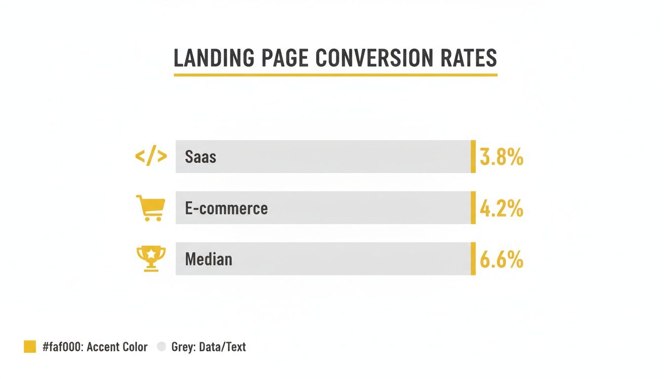
The data shows that while 6.6% is a great overall target, industries like SaaS and E-commerce have a lower starting point. This just highlights how important it is to tailor your optimization strategy to your specific market.
Key Takeaway: Stop comparing your local service lead gen page to a global SaaS company's free trial page. Use the right benchmark, set achievable goals, and start measuring what actually matters for your business.
Figuring Out Why Your Landing Page Isn't Working
Before you start messing with button colors or rewriting headlines, you have to play detective. The secret to a high-converting landing page isn’t guesswork; it’s an honest, unflinching audit of what’s currently working—and what’s actively pushing people away. We need to find the friction.
This isn't about running through a generic checklist. It's about a real diagnosis. I break this down into four critical areas: Offer Clarity, Message Match, the actual User Experience, and the strength of your Call-to-Action (CTA). By looking at your page through these four lenses, you can stop guessing and start building a real roadmap for improvement.
First Things First: Offer Clarity and Message Match
You’ve got about ten seconds, maybe less, to make an impression. If a visitor lands on your page and can't immediately figure out what you're selling and why they should care, they're gone. It's that simple. That's Offer Clarity. You have to ask yourself: is my main value proposition staring them in the face, above the fold, in plain English?
Just as crucial is what I call Message Match. It's the promise you make in your ad versus the experience they get on the page. Someone who clicks an ad for "50% Off Custom T-Shirts" needs to land on a page that practically screams, "Here's Your 50% Off Custom T-Shirts!"
Look at your ad copy and creative. Does the headline and imagery in your ad line up perfectly with what's at the top of your landing page?
Read your page headline. Does it instantly tell the visitor, "Yep, you're in the right place," and use the same language from the ad they just clicked?
Check for consistency. Are the specific offer, the price, and the benefits you highlighted in the ad impossible to miss on the page?
Any gap between your ad and your page creates instant confusion and kills trust. It’s the number one reason for sky-high bounce rates and the bedrock of any landing page that actually works.
Dig Into the User Experience (With Real Data)
Your page's design can either be a smooth, straight line to a conversion or a frustrating maze that leads straight to the back button. This is where you have to stop trusting your own opinion and start looking at what real people are doing.
This is where tools like Hotjar or Crazy Egg become your best friends. Heatmaps show you exactly where people are clicking, how far they're scrolling, and where their mouse is hovering. Session recordings are even better—you get to watch a replay of a visitor's entire journey, seeing every hesitation, every confused scroll, every rage click.
You're no longer just guessing. You can literally watch someone get stuck on your form, scroll right past your best testimonial, or abandon your cart because they can't find the shipping info. This is how you find the "low-hanging fruit" that will give you the quickest wins.
For instance, a heatmap might show you that a ton of people are clicking on a product image that isn't a link. That’s a five-minute fix. A session recording could show user after user struggling to find the return policy, telling you exactly what information you need to make more prominent.
How Strong Is Your Call-to-Action?
Finally, we get to the moment of truth: your Call-to-Action. This is where the visitor has to make a decision. A weak, confusing, or hidden CTA will tank the performance of even the most perfectly designed page.
Here’s a quick teardown I run on every CTA:
Clarity and Value: Does the button text tell them exactly what’s going to happen? Ditch generic stuff like "Submit" or "Click Here." You need action-oriented, value-driven text. Think "Get My Free Quote" or "Download the Guide Now."
Visual Prominence: Can you spot the button in three seconds? It needs to pop. Use a color that contrasts with the rest of the page, make it big enough to see, and put it where people expect it. A button that blends in is a button that gets ignored.
Friction Reduction: What happens after they click? Take a hard look at your form. Are you asking for their life story? Every single field you add is another reason for them to bail. A classic HubSpot study found that just cutting form fields from four to three can boost conversions by nearly 50%.
When you diagnose your page through these four pillars, you're swapping assumptions for a data-backed understanding of what your visitors are actually doing. This methodical approach gives you a prioritized hit list of fixes that will truly move the needle.
Crafting High-Converting Copy and Design
Think of your landing page as your best salesperson—the one that never sleeps. Once you've figured out what's holding it back, it's time to roll up your sleeves and get to work. This is where we move from diagnosing problems to taking real action, writing copy that persuades and designing a page that guides every single visitor toward one specific goal.
The whole point is to create an experience that feels completely effortless. The secret isn't more flash or fancy features; it's about ruthless simplicity. Every word, every image, every button has to serve the conversion goal. Anything else is just noise getting in the way.

The Underrated Power of Simplicity
Clarity is your number one conversion driver. Why? Because a confused mind always says no. The highest-performing landing pages are the ones that relentlessly cut out distractions.
A perfect place to start is the navigation menu. While it’s essential for your main website, on a landing page, it’s just an escape hatch. The data on this is wild—simply removing the navigation can boost conversions by around 100%.
The same goes for your copy. Writing at a 5th to 7th-grade reading level can push median conversion rates to 11.1%, a huge jump from the 5.3% you see with college-level writing. It's proof that simplicity wins, which is a core principle behind how we scale our clients at Wojo Media. You can dig into more of these stats on Salesgenie's blog about landing page statistics.
This principle extends to your offer, too. Stick to one clear call to action. Presenting multiple choices can cause a 48% drop in conversions. Focus your visitor's attention like a laser on the one thing you want them to do.
Structuring Your Page for Maximum Impact
A great landing page tells a story. It’s a conversation that grabs attention, builds interest, creates desire, and then asks for action. It’s not a brochure you just dump on someone’s screen.
Here’s how we structure that conversation:
Compelling Headline: Your headline has one job: get them to read the next sentence. It needs to hit on their problem and promise a solution, fast.
Benefit-Driven Sub-Headline: This is where you expand on that promise. Don't just list features; spell out the tangible benefits they'll get.
Visually Engaging Hero Section: This is your first impression. Your headline, sub-headline, and hero image have to instantly tell the visitor, "You're in the right place."
Pro Tip: Your hero section should pass the five-second test. Could someone understand your core offer in five seconds without any sound? If not, it’s too complicated.
Choosing the Right Visuals
The visuals on your page aren't just there to look pretty. They build an emotional connection and direct the user’s eye. The choice between video and images is a strategic one.
Video is a beast for storytelling and showing off complex products. In fact, 38% of marketers say video gives them the biggest conversion lift. But don’t sleep on high-quality images and graphics—they’re a close second at 35% and are often way more practical to produce.
One of the most powerful visuals you can use is a human face. For e-commerce, local services, and coaches, 73% of top-performing pages feature authentic human faces in their hero sections. They grab attention, build instant trust, and make your offer feel more real. Just promise me you'll avoid generic stock photos. They scream "corporate" and can actually hurt your credibility.
Weaving in Social Proof for Instant Trust
People trust other people way more than they trust brands. That’s why social proof isn't just a nice-to-have; it's a non-negotiable part of a high-converting page. You have to show visitors that people just like them are already winning with your product or service.
Sprinkle social proof throughout the page, not just in one big "testimonials" block.
Customer Reviews & Ratings: Put these right next to your call-to-action to squash any last-minute doubts.
Short Testimonials with Photos: A powerful quote paired with a real customer's headshot is infinitely more believable.
Case Study Snippets: Pull out a killer statistic or result from a case study and make it a focal point.
"As Seen On" Logos: If you've been featured in the media or have big-name partners, use their logos to borrow some of their credibility.
When you blend simple, persuasive copy with a design that builds trust, you create a smooth path from the first click to the final conversion. Every element works in harmony to answer questions, ease doubts, and confidently guide your visitor to take action.
Aligning Ad Campaigns With Your Landing Page
Even a perfectly designed landing page will fall flat if the journey to get there is broken. Visitors don’t just magically appear; they click through from an ad, an email, or a social post. That transition from where they started to where they land needs to be absolutely seamless.
The most critical piece of this puzzle is message match. It’s a simple concept, but the impact is huge: the promise you make in your ad has to be immediately and obviously fulfilled the second someone hits your page. If your ad shouts "50% Off Summer Sale," your landing page headline better be screaming the same thing. Any disconnect, no matter how small, creates instant confusion and kills trust before you’ve even made your case.

Think of it as building a bridge of trust. Every element—from the headline and imagery to the specific words you use—has to be consistent from ad to page.
Your Traffic Source Dictates Your Strategy
Not all traffic is created equal. Someone clicking from a warm email newsletter is in a completely different headspace than someone who just saw a flashy display ad for the first time. Your landing page has to adapt.
I’ve seen this play out time and time again. You simply can't treat every visitor the same way and expect great results. The data backs this up, showing just how stark the differences are between channels.
Take a look at how different traffic sources typically perform. The gap between a warm and cold audience is massive.
Traffic Source vs. Average Conversion Rate
Traffic Source | Average Conversion Rate |
|---|---|
Email Marketing | 19.3% |
Paid Social | 12.0% |
Paid Search | 10.9% |
Display Ads | 4.1% |
What this tells us is that an audience that already knows you (like your email subscribers) is primed to convert and needs less convincing. On the other hand, cold traffic from a display ad requires a page that works much harder to build credibility and show value from the ground up.
The Technical Details That Make or Break Performance
Beyond the messaging, a few technical details can completely tank your conversion rates if you ignore them. The biggest one? Page load speed. In a world of instant gratification, every single second counts.
Studies consistently show that the sweet spot for load time is between two and five seconds. For every second of delay beyond that, you can watch your conversion rate drop by as much as 7%. A page that’s just a few seconds too slow could be costing you a fortune.
To keep things snappy, focus on these tune-ups:
Optimize Your Images: Huge, uncompressed images are the #1 cause of slow pages. Use modern formats like WebP and compress everything without sacrificing too much quality.
Manage Your Scripts: Third-party tools can load a ton of extra code that drags your page to a halt. Audit what you’re running and cut anything that isn’t absolutely essential.
Design for Mobile First: With 83% of traffic coming from mobile, your page has to be flawless on a phone. Yet, mobile conversion rates still trail desktop by about 8%. Building dynamic pages that adapt content for mobile users can close this gap, converting 25.2% more visitors.
Aligning your ad campaigns with your landing page isn't just about matching a headline. It's about creating a smooth, high-speed journey from the first click to the final conversion, all supported by a technically sound and lightning-fast experience.
To make sure all your tracking data is clean and consistent, it's worth brushing up on UTM parameter best practices for flawless tracking. This ensures every click is attributed correctly, giving you a crystal-clear picture of what’s working and what isn’t.
Running A/B Tests That Actually Drive Growth
Getting your page live isn't the finish line. Far from it. Once the audits are done, the copy is polished, and the ads are running, the real optimization begins. This is where you stop making educated guesses and start getting hard proof with A/B testing. Think of it as the engine that powers sustainable, predictable growth.
But let’s get one thing straight: running tests just to say you’re testing is a massive waste of traffic and money. We're not here to find out if a green button is magically better than a blue one. The goal is to systematically prove or disprove smart ideas that lead to real, measurable lifts in conversions. It’s how you finally stop wondering what your audience wants and start knowing.
Forming a Strong Hypothesis
Every test that’s worth running starts with a strong, data-backed hypothesis. Your page audit should have already handed you a list of potential culprits—a headline that’s falling flat, a form that’s asking for too much, or a call-to-action that’s just plain weak. Each of these is a launchpad for a great test.
A solid hypothesis is more than just a vague idea; it's a structured prediction. It should always follow this simple formula: "If I change [X], then [Y] will happen, because [Z]."
Here’s the difference. A weak hypothesis is: "Let's test a new headline." It's lazy and directionless.
A strong, actionable hypothesis sounds like this: "If we change the headline from a feature-focused one ('Our Advanced CRM Software') to one that’s benefit-focused ('Close More Deals in Half the Time'), then we’ll see an increase in lead form submissions, because the new headline speaks directly to the user’s core motivation for efficiency."
See the difference? That structure forces you to justify why you're running the test and ties it directly to a business goal. You're not just throwing things at the wall; you're running a calculated experiment.
What Should You Test First
The temptation to start with tiny, easy tweaks like button colors is strong. I get it. But while those can make a difference, your first few tests need to focus on the elements that have the biggest potential to move the needle. You want to swing for the fences before you start worrying about small ball.
Here’s where I’d put my money first:
Your Headline and Sub-headline: This is your first impression, your virtual handshake. A change here can completely reframe how a visitor sees your entire offer.
The Call-to-Action (CTA): Go beyond color. Test the actual words on the button. A CTA that goes from a generic "Submit" to a specific "Get My Free Strategy Call" can have a huge impact.
Hero Image or Video: This visual sets the entire mood. Test a clean product shot against a lifestyle image showing someone using it. Try an animated graphic versus a raw customer testimonial video.
Form Length and Layout: Are you asking for their life story upfront? For a local service, cutting a form from five fields down to just three could easily double your leads.
Social Proof: Don’t just slap a testimonial on the page. Test which one you use and where you put it. Does placing a powerful customer quote right below the CTA help crush last-minute doubt?
Here’s the golden rule: test one major thing at a time. If you change the headline, the CTA, and the hero image all at once, you’ll have no idea which change actually caused the lift (or, worse, the drop) in conversions. Be patient and methodical.
The Right Tools and Why Patience Pays Off
To run these tests, you’ll need some tech. Platforms like Unbounce, Leadpages, and Instapage have A/B testing built right in, making it pretty straightforward to get a simple test up and running. For more firepower, tools like VWO and Optimizely can handle much more complex experiments across your entire site.
Once a test is live, the single most important concept to nail down is statistical significance. This is just a fancy way of measuring how confident you can be that your results aren't a fluke. The industry standard is 95% confidence.
This means you have to let your test run long enough to gather enough data. Seriously, this is the biggest mistake I see people make. They call a test after two days because one version is ahead. That’s not a winner; that’s just noise. You need to let a test run for at least one or two full business cycles—a couple of weeks, usually—to smooth out any weird fluctuations in traffic or user mood.
By methodically testing your core assumptions, you start building a page that isn't just based on someone else's "best practices." It's a page that's been proven, with data, to work for your audience. This is how you turn your ad spend into predictable, scalable revenue.
Got Questions About Landing Page Optimization?

If you're digging into landing page optimization, you probably have some questions. It’s a common scenario for marketers and business owners alike.
Let's clear up some of the most frequent ones I hear.
How Long Should I Run My A/B Tests?
There's no single magic number, but the real goal is to hit statistical significance—ideally with at least 95% confidence. It’s tempting to call a test early when one version is winning, but don’t.
A good rule of thumb is to aim for at least 100 conversions per variation. Also, let the test run for at least one or two full business cycles (say, two weeks) to smooth out any daily or weekly traffic spikes.
Patience is key here. Let the test run its course to get clean data you can actually trust.
If you’re not sure how much traffic you’ll need, a quick search for an online significance calculator can give you a solid estimate.
What Are the Most Important Elements to Test First?
You want to start with the big hitters—the elements that make the biggest first impression and have the most influence on a user's decision.
I always recommend focusing on these four first:
Headline and sub-headline: This is your first (and sometimes only) shot to grab their attention.
The main Call-to-Action (CTA): Everything from the text and color to its placement can dramatically shift results.
Hero image or video: The right visual connects emotionally and tells a story faster than words can.
Form fields and layout: The friction here is real. Reducing the number of fields or simplifying the design often leads to more completions.
Sometimes, a radical redesign—a completely new layout or offer—will give you a much bigger lift than just tweaking a button color. Don't be afraid to think big.
Should I Create Different Landing Pages for Mobile and Desktop?
While a responsive design is the bare minimum, creating distinct experiences for mobile and desktop users can be a game-changer. Think about the user’s context.
Someone on their phone is often distracted and in a hurry. They need a punchy, thumb-stopping headline and big, tappable CTAs. Keep it concise.
On the other hand, a desktop user is usually more focused and willing to dig into the details. They can handle longer copy, more complex forms, and deeper content.
Here’s a simple breakdown:
Device | Focus Area |
|---|---|
Mobile | Short copy, large CTAs, single-column layout |
Desktop | Detailed benefits, multi-section pages |
For a deeper dive, especially for e-commerce, our guide on High-Converting Ecommerce Landing Pages is a great resource.
How Do I Know If My Changes Are Actually Working?
Gut feelings don't cut it. You need solid tracking to measure what’s happening.
Set up goals in Google Analytics to track every form submission or key button click.
Use heatmaps to see where people are actually looking and clicking on your page.
Install session recording tools to watch real user sessions. You’ll be amazed at the friction points you uncover.
Data gives you clarity. It turns guesswork into a strategic plan for what to optimize next.
What Are Some Common Mistakes to Avoid?
I see the same mistakes trip people up all the time. Steer clear of these:
Testing too many things at once. If you change the headline, image, and CTA all at the same time, you'll have no idea which change actually made a difference.
Ignoring the mobile experience. With mobile driving as much as 83% of traffic in some industries, a clunky mobile page is a conversion killer.
Calling tests too early. You need a large enough sample size to get statistically significant results. Don't trust a test that's only run for a day or two.
Avoiding these common blunders will save you from chasing bad data and wasting valuable traffic. Stick to a methodical process, and you’ll see your conversion rates steadily climb.
Ready to supercharge your landing pages? Book a demo with Wojo Media https://www.thewojomedia.com
Comments