.png)
How to Improve Ecommerce Conversion Rate A Practical Guide
- Jason Wojo
- Dec 14, 2025
- 17 min read

Before you can boost your e-commerce conversion rate, you need to know exactly where you're starting from. This means getting real about your numbers—understanding the industry averages, digging into your own store's metrics, and facing the often-sobering gap between how desktop and mobile users behave.
Only then can you set goals that make sense and build a strategy that actually targets your biggest opportunities for growth.
Setting a Realistic Baseline for Your Store
Let's be honest. Before you start running a bunch of A/B tests or playing with fancy psychological triggers, you have to get a clear picture of where your store stands today. Without a baseline, "improvement" is just a word you're throwing around. I've seen too many store owners chase some random conversion rate they heard about, only to end up frustrated and having wasted a ton of effort.
Establishing this baseline isn't about feeling bad about your past performance. Think of it as drawing a starting line in the sand. It’s the essential first step that will guide every single decision you make on your conversion rate optimization (CRO) journey. As you start this process, it's a good idea to look into comprehensive e-commerce solutions that can give you the tools you need to get the job done right.
Understanding the Averages
So, what’s a "good" e-commerce conversion rate? The real answer is: it depends. A lot. Performance swings wildly depending on your industry, where your traffic is coming from, and what device people are using. Still, knowing the general landscape helps you set targets that are ambitious but achievable.
Looking at 2025 data, the global average e-commerce conversion rate is sitting around 1.9%. But here's the encouraging part: well-optimized Shopify stores often hit 2.5-3%. That tells you strategic tweaks really do move the needle.
The most glaring number, though, is the massive gap between devices. Desktop converts at a pretty solid 3.9%, but mobile is way behind at just 1.8%. If that doesn't scream "focus on mobile," I don't know what will.
This chart really puts the numbers into perspective, showing how average stores stack up against top performers and highlighting that desktop-mobile divide.
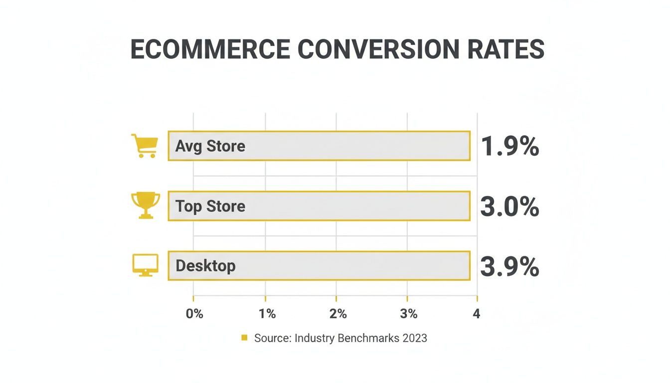
The visual makes it painfully clear: there's a big difference between being average and being a top-tier store, and desktop is still king when it comes to closing the sale.
Benchmarking Against Your Industry
Comparing your fashion boutique to a big-box electronics store is like comparing apples to oranges—it’ll just lead you to the wrong conclusions. Conversion expectations are completely different across industries, shaped by things like how long people take to decide, average order value (AOV), and how often they buy.
A store selling high-end, custom furniture will naturally have a lower conversion rate than one selling everyday lipstick. The whole point is to measure yourself against relevant competitors so you can spot realistic growth opportunities, not chase impossible numbers.
To give you a clearer picture, here’s a quick summary of key conversion rate stats.
Ecommerce Conversion Rate Benchmarks At a Glance
This table provides a quick summary of key conversion rate statistics by device and industry to help you benchmark your store's performance.
Metric | Average Rate |
|---|---|
Global Average | 1.9% |
Top Shopify Stores | 2.5% - 3% |
Desktop | 3.9% |
Mobile | 1.8% |
Fashion & Apparel | 1.5% - 2.5% |
Health & Beauty | 3% - 6% |
Electronics | 1.5% - 2% |
Food & Beverage | 4%+ |
These industry-specific benchmarks show just how much context matters.
Fashion & Apparel: Usually falls between 1.5% to 2.5%. It's a super competitive space where a lot of visitors are just browsing for inspiration.
Health & Beauty: Often does much better, hitting 3% to 6%. These are often repeat purchases with a lower price point, making the buying decision easier.
Electronics: Hovers around 1.5% to 2%. The higher AOV means people spend a lot more time researching before they commit.
Food & Beverage: Can crush it with rates of 4% or higher, especially with repeat buys and popular subscription models.
Once you understand these nuances, you can stop worrying about some universal average and start focusing on what it takes to be a top performer in your specific niche. That targeted approach is the bedrock of any successful CRO strategy.
Finding and Fixing Your Conversion Leaks
Every abandoned cart, every bounced visitor, and every abrupt product page exit is a “leak” in your sales funnel. These aren’t just abstract numbers on an analytics dashboard; they’re stories of customer friction. To really move the needle on your conversion rate, you have to become a detective, hunting down the exact moments shoppers lose confidence, get confused, or just give up.
This goes way beyond glancing at your overall conversion rate. The real answers—the ones that unlock growth—are buried deeper, in user behaviors that analytics alone often obscure. You need to trace the entire customer journey, from the instant they click your ad to the second they hit the "Thank You" page, and pinpoint the specific roadblocks that are quietly bleeding you dry.
Mapping the Customer Journey to Find Friction Points
You can't fix what you can't see. Before you change a single button, you need a map of the battlefield. A standard e-commerce journey has several key stages, and leaks can pop up at any one of them. Your job is to figure out where the drop-off is most severe.
Start by walking in a new visitor’s shoes. Do they land on a product detail page straight from an Instagram ad? Do they start by browsing category pages? What actually happens when they add an item to their cart and try to check out?
The most common friction points are usually hiding in plain sight:
Product Discovery: A visitor can't find what they're looking for because of clunky navigation or a search bar that just doesn't get it.
Product Page Evaluation: The page is missing the good stuff—compelling images, detailed descriptions, or social proof like customer reviews.
Cart & Checkout: This is where the money is made or lost. This stage is notorious for surprise fees, painfully long forms, or a frustrating lack of payment options.
By breaking the journey down into these smaller "micro-funnels," you stop looking at a vague problem like "low conversions" and start seeing a specific, solvable one, like "a 60% drop-off between the cart and checkout pages." Now that's a problem you can sink your teeth into.
Going Beyond Analytics with Qualitative Data
Your analytics platform tells you what is happening. For instance, it might tell you that 70% of users abandon their carts. But it rarely tells you why. This is where qualitative tools become your secret weapon.
Think of it this way: analytics is the X-ray showing you a broken bone. Qualitative data is the patient telling you exactly how and where it hurts. Tools like heatmaps, for example, show you where users are clicking (and, more importantly, not clicking), instantly revealing ignored CTAs or confusing design choices.
Session recordings are even more powerful. I can’t tell you how many “aha” moments I’ve had watching real users navigate a client’s site. It’s an eye-opening, often humbling experience. You’ll see people rage-click on broken links, struggle with forms, and get stuck in navigation loops you never even knew existed. This is the unfiltered, undeniable proof you need to know what to fix first.
Combine this visual evidence with user surveys and simple feedback forms. Sometimes, the easiest way to figure out what's wrong is just to ask. This direct feedback is absolute gold for prioritizing your efforts.
Identifying the Most Common Conversion Killers
While every store has its own unique quirks, I've seen the same conversion killers pop up time and time again. As you audit your site, keep a sharp eye out for these usual suspects. They're often the source of your biggest leaks and represent the lowest-hanging fruit for a quick lift in conversions.
Surprise Shipping Costs: This is the undisputed champion of cart abandonment. Be upfront about shipping fees from the get-go or, even better, offer a clear, attainable path to free shipping.
Forced Account Creation: Nothing says "I don't respect your time" like forcing someone to create an account to buy something. Always, always offer a guest checkout option.
Lack of Trust Signals: Shoppers are wary. If they don't see security badges, a clear return policy, or customer reviews, they're not going to feel comfortable handing over their credit card info.
A Terrible Mobile Experience: A site that’s slow or a nightmare to navigate on a phone will absolutely tank your conversion rate, especially since most of your traffic is probably coming from mobile devices anyway.
A major conversion leak is abandoned carts; learn how to recover lost sales with effective strategies for abandoned cart emails that can bring customers back to complete their purchase. Once you've identified these leaks, you can build a prioritized roadmap of fixes and A/B tests designed to systematically plug the holes and turn more of your visitors into paying customers.
Winning Customers on Mobile Devices
If your store isn't built for a small screen, you're not just behind the times—you're actively turning away most of your potential customers. A clunky, slow, or confusing mobile site is a direct drain on your revenue. Honestly, turning your mobile experience into your biggest asset is one of the fastest ways to improve your ecommerce conversion rate. This isn’t about just shrinking your desktop site down. It’s about a complete mental shift to a mobile-first philosophy.
Think about it. The modern shopper’s journey almost always starts on a phone. They see an ad on Instagram, click a link from a friend, or do a quick search while waiting in line for coffee. If that first interaction is anything less than perfect, they’re gone. And they're probably not coming back. Every button, form field, and image has to be optimized for the thumb, not the mouse.

The data tells a pretty stark story. Mobile commerce is on track to account for 59% of total online retail sales by 2025, making it the primary battleground. Yet, a massive gap still exists: mobile conversion rates are stuck at a miserable 1.8%, while desktop cruises along at 3.9%. This gap is a huge opportunity for stores that get mobile right, especially when global cart abandonment is a staggering 70.19%, mostly thanks to frustrating mobile checkouts. If you want to dive deeper, you can discover more ecommerce statistics and insights.
Redesigning for the Thumb
Take a second and think about how you actually hold and use your phone. It’s a one-handed, thumb-driven experience, right? Your mobile site has to reflect that reality. Buttons need to be big, well-spaced, and placed in easy-to-reach "thumb zones"—usually the bottom and center of the screen. Forcing someone to stretch their thumb to the top corner for the menu or cart is just asking for them to give up.
This thinking applies to every interactive element:
Large Tap Targets: Make sure every link and button has enough padding around it so people can tap it easily without hitting something else by mistake.
Simplified Navigation: Stick with a clean "hamburger" menu. Only show your most important categories and don't overwhelm people with a wall of choices.
Legible Fonts: Text has to be readable without any pinching and zooming. I always aim for a font size of at least 16px for body copy.
The goal here is to eliminate all friction. Every time a user has to stop and think about how to use your site or has to awkwardly shift their grip, you’re just giving them another reason to leave.
Streamlining Mobile Checkout and Payments
The mobile checkout is where countless sales go to die. Nobody enjoys typing in shipping addresses and credit card numbers on a tiny keyboard; it's tedious and full of typos. You have to be absolutely ruthless in simplifying this process.
A guest checkout option is completely non-negotiable. From there, shorten your forms to only the absolute essentials. Use tools like address auto-completion to cut down on typing.
Most importantly, you need to integrate one-click payment options like Apple Pay and Google Pay. These aren’t just nice extras anymore; they are essential conversion tools. They let shoppers skip all the manual form-filling and buy with just a fingerprint or face scan. I’ve seen brands reduce cart abandonment by up to 20% just by implementing these.
The Need for Speed and Social Integration
Let’s be real: mobile users are impatient. A page that takes more than three seconds to load is going to lose a huge chunk of its visitors. Use tools to compress your images, leverage browser caching, and maybe even look into Accelerated Mobile Pages (AMP) for a near-instant load time.
This speed is especially critical for social commerce. When someone clicks your ad on TikTok or Instagram, the jump to your landing page has to be instant and seamless. The product they see must be the exact one from the ad, with a big, obvious path to purchase.
Seamless Ad-to-Page Experience: The message, images, and offer from your social ad have to match the landing page perfectly. No surprises.
Direct Purchase Paths: Let people buy directly from social platforms if you can. If not, send them to a product page with a "Add to Cart" button they can't miss.
By focusing on these mobile-first principles—designing for the thumb, simplifying checkout, and obsessing over speed—you stop fighting against your customers' habits. Instead, you build an experience that feels natural, intuitive, and, most importantly, incredibly easy to buy from.
Using Psychology to Build Trust and Urgency
A slick UI and blazing-fast load times will get you to the one-yard line, but it's human psychology that punches it into the end zone. If you really want to move the needle on your conversion rate, you have to tap into two powerful emotions every shopper brings to the table: the need for trust and the fear of missing out.
This isn't about shady manipulation. It’s about aligning your store’s entire experience with how people actually think and behave. You build real trust by being transparent and reassuring. You create ethical urgency by nudging hesitant shoppers toward a decision they were already leaning into. Nail this balance, and you’ll turn browsers into buyers.

Building an Unshakeable Foundation of Trust
First-time visitors land on your site with their guard up. They're silently asking, "Is this place legit? Is my credit card info safe? What if I hate this and need to return it?" Your job is to answer these questions before they become roadblocks.
Start with the obvious wins. Slap some security badges from known names like Norton or McAfee on your checkout page. These little icons are a universal sign for "your data is safe here." But genuine trust is built on more than just a badge.
The most powerful trust signal isn't something you add; it's something you are. Authenticity, demonstrated through unfiltered customer reviews, transparent policies, and responsive support, builds a level of confidence that no security seal can replicate.
One of the easiest ways to build this confidence is with a dead-simple, customer-first return policy. Don't bury it in the footer. Shout it from the rooftops on your product pages with something like "Easy 30-Day Returns." That one little phrase melts away a massive amount of purchase anxiety.
Crafting Ethical and Effective Urgency
Okay, so they trust you. Now what? You need to give them a compelling reason to buy now instead of "later" (which often means never). This is where urgency comes in, but you have to tread carefully. Fake countdown timers and inflated stock claims will torch the trust you just built.
Real urgency, on the other hand, is a powerful motivator. It taps into a core human bias called loss aversion—the simple idea that the pain of losing something feels way stronger than the pleasure of gaining it. When a shopper thinks that product they want might vanish or a deal might expire, they're wired to act.
Here are a few ways to create real urgency:
Low-Stock Alerts: A simple "Only 3 left in stock!" is incredibly effective, especially if it’s tied to your actual inventory system.
Countdown Timers: Got a flash sale or a holiday promo? A visible clock counting down "Sale ends in 02:14:55" creates a hard deadline.
First-Time Buyer Offers: A classic for a reason. "Get 15% off your first order - offer expires in 24 hours" gives new customers a great reason to pull the trigger immediately.
A/B Testing Your Way to Higher Conversions
You'd be shocked at how tiny tweaks to your trust and urgency signals can lead to massive lifts in conversion. This is exactly why A/B testing is non-negotiable. Stop guessing what works and let your customers tell you directly through data.
For instance, you could test where you place your security seals. Do they perform better right under the "Complete Purchase" button or in the header? Or maybe you test your low-stock copy. Does "Selling fast!" beat out a specific number like "Only 5 left"?
To get you started, here are a few simple but powerful A/B tests you can run to dial in your trust and urgency messaging.
A/B Test Ideas for Trust and Urgency
Element to Test | Control (Version A) | Variation (Version B) | Potential Impact |
|---|---|---|---|
Call-to-Action | "Add to Cart" | "Secure My Order Now" | Reinforces security and ownership, potentially reducing last-minute hesitation. |
Return Policy | Link in footer | "Free 30-Day Returns" badge on product page | Increases confidence by making the policy visible at the point of decision. |
Urgency Copy | "Sale Ends Soon" | "Sale Ends at Midnight!" | Creates a specific, concrete deadline, making the urgency more believable. |
By systematically testing these psychological triggers, you can fine-tune your messaging to build maximum trust and create compelling urgency, turning your site into a more effective conversion engine.
Designing Product Pages and Checkouts That Convert
That final stretch—from a confident "Add to Cart" click to the reassuring "Order Confirmed" screen—is where the real conversion battles are won or lost. This is your moment of truth.
You can do everything right to get a visitor this far, but a poorly designed product page or a clunky checkout will erase all that hard work in a heartbeat. This is where you have to nail the details to turn a hesitant browser into a happy, paying customer.
Forget the generic advice. Let's get into a practical playbook for perfecting these critical touchpoints. We’ll break down how to build product pages that actually sell and a checkout flow that feels so effortless it’s almost invisible.
Crafting Product Pages That Reassure and Persuade
Your product page really only has one job: convince the shopper that this product is the right solution for them and that your store is the right place to buy it from. Getting this right is a delicate balance of compelling visuals, benefit-driven copy, and undeniable social proof.
Shoppers scan; they don't read essays. Forget long, rambling paragraphs of features. They want to know "What's in it for me?"—and they want to know it fast.
Lead with Benefits, Not Just Features: Don't just say "100% organic cotton." Frame it as, "Breathe easier with fabric that’s softer on your skin—and the planet." You're selling the outcome, not the material.
Use High-Resolution Imagery and Video: Your customers can't touch or feel the product, so your visuals have to do all the heavy lifting. Show every angle, in-context shots, and close-ups of the texture. A short video showing the product in action is even better—it closes the gap between seeing and truly experiencing it.
Strategically Place Social Proof: Don't bury your best reviews at the bottom of the page where no one sees them. Sprinkle your most compelling, result-driven testimonials right next to the "Add to Cart" button. A quote like, "This cleared up my acne in two weeks!" placed right where they're about to make a decision is incredibly persuasive.
Think of your product page as your best salesperson. It needs to anticipate questions, handle objections, and build excitement. Every single element, from the headline to the return policy badge, should work together to build unstoppable momentum toward the cart.
When you focus on these elements, you're not just displaying a product; you're telling a story and building the confidence they need to make that crucial click.
Eliminating All Friction from Your Checkout Flow
If the product page builds momentum, the checkout is where you must protect it at all costs. The slightest bit of friction here sends people running for the exit. Data shows time and time again that unexpected costs and complicated processes are the top reasons shoppers bail.
Your goal is to make the checkout experience so smooth, it’s practically an afterthought.
First things first: never, ever force a customer to create an account. It’s a notorious conversion killer. Always offer a guest checkout option. Forcing registration adds a pointless step that feels like a chore, sending shoppers straight to your competitors.
Next, you need to be ruthless about simplifying your forms. Only ask for the absolute bare minimum you need to process the order.
Reduce Form Fields: Do you really need their phone number? Can "First Name" and "Last Name" be combined into a single "Full Name" field? Every field you cut increases your completion rate.
Use Address Autofill: Tools that automatically complete a shipping address after a few keystrokes are a lifesaver, especially on mobile. They reduce typing, minimize errors, and just make things easier.
Show a Progress Bar: Guide users visually through the steps (e.g., Shipping > Payment > Review). This manages their expectations and makes the whole process feel shorter and more organized.
The Power of Transparency and Reassurance
The single biggest enemy of a high-converting checkout is surprise. A shopper who has mentally agreed to a certain price will feel completely betrayed if unexpected shipping fees or taxes suddenly pop up on the final screen.
Display all costs upfront. Show taxes and calculate shipping as early as you possibly can—ideally on the cart page itself. And if you offer free shipping, make that promise loud, clear, and visible throughout the entire process.
Finally, you have to reinforce trust right up to the last second. Prominently place security badges (like Norton or McAfee) and accepted payment logos (Visa, PayPal, Apple Pay). Even a simple reminder of your "Easy 30-Day Returns" policy on the checkout page can be the final piece of reassurance a nervous buyer needs to click "Complete Purchase."
By combining a frictionless design with total transparency, you create a checkout experience that builds confidence and maximizes your conversion rate.
Common Questions About Ecommerce Conversion Rates
Jumping into conversion rate optimization often feels like opening a can of worms. It's a world full of nuance, where a killer strategy for one store might completely bomb for another. To help you cut through the noise, I’ve put together a quick guide to tackle the most frequent questions I hear from brands trying to nail their conversion rate.
Think of this as your field manual for refining your strategy, troubleshooting the usual roadblocks, and setting expectations that actually make sense for your business.
What Is a Good Ecommerce Conversion Rate
This is the million-dollar question, but the answer isn't just one number. Sure, the global average sits around 1.9%, but a truly "good" rate depends entirely on your industry, average order value, where your traffic comes from, and what devices people are using to shop.
Chasing some universal benchmark is usually a waste of time. A much smarter move is to benchmark against your specific vertical and, even more critically, against your own past performance. For example, some brands in the health and beauty space can hit conversion rates north of 6%, while a store selling high-end electronics might do well to see 1.5%.
The real goal isn’t to hit an arbitrary number but to build a system of continuous, incremental improvement. Bumping your store from 1.5% to 1.8% might not sound like front-page news, but that’s a 20% lift in conversions—a massive impact on your bottom line without spending a dollar more on traffic.
Focus on beating your own numbers month after month. That’s a real measure of success and a clear sign your efforts are paying off.
How Long Does It Take to See an Improvement in Conversion Rate
How fast you'll see results boils down to two things: the impact of the change you make and the amount of traffic you get. You need enough data to hit what’s called statistical significance—a fancy way of saying you’re confident the results aren’t just a random fluke.
Some changes can move the needle almost overnight.
Quick Wins: Simple, high-impact fixes like adding trust badges above the fold, making your shipping policy obvious, or rewriting a confusing call-to-action can show results in days on a high-traffic site.
Big Swings: Overhauling your entire checkout flow or redesigning product pages from the ground up is a different beast. These moves usually need weeks of A/B testing to collect enough data to confidently pick a winner.
If your store has lower traffic, patience is everything. It will just take longer to get enough data to know if your test worked. The golden rule here is to test one major thing at a time. If you change your headline, button color, and product images all at once, you’ll have no clue which change actually drove the lift (or the drop) in conversions.
What Are the Most Common Reasons for a Low Conversion Rate
When I audit a store with a sagging conversion rate, I almost always find the same core problems: friction and a lack of trust. These two conversion killers show up in a few common ways that you should check out immediately if your numbers are in the gutter.
The biggest culprits are almost always one of these:
Unexpected Costs: This is the #1 reason for cart abandonment, period. Surprise shipping fees, taxes, or other charges that pop up on the final checkout screen feel like a bait-and-switch and will send shoppers packing.
A Complicated Checkout: Forcing people to create an account, hitting them with a wall of form fields, or dragging them through a multi-page checkout process just creates roadblocks to the sale.
A Poor Mobile Experience: Most of your traffic is on mobile. If your site is slow, a pain to navigate, or has tiny, un-clickable buttons on a small screen, you’re basically telling most of your customers to get lost.
Lack of Trust Signals: Shoppers today are skeptical. Without clear social proof like customer reviews, visible security seals, and an easy-to-find return policy, they won't feel safe enough to pull out their credit card.
Running a proper CRO audit—combining your analytics with tools like heatmaps and session recordings—is the fastest way to find the specific friction points that are bleeding your store dry.
Ready to stop guessing and start scaling? The team at Wojo Media bolts onto your brand to fix conversion leaks and build omnipresent ad campaigns that deliver predictable, profitable growth. Book a free demo call and get a custom strategy to improve your ecommerce conversion rate.
Comments