.png)
How to increase website conversion rate: Proven CRO tactics
- Jason Wojo
- Jan 31
- 16 min read

If you want to actually increase your website's conversion rate, you have to stop guessing and start being systematic. It comes down to improving four core things: your Offer, your Landing Page, your Ad Strategy, and how you use Data.
It's a chain, and it's only as strong as its weakest link. A killer offer won't sell if your landing page is a disaster, and a brilliant ad campaign is just wasted money if the offer itself is weak. When you get all these elements working together, you create a smooth path that turns more visitors into paying customers.
Laying the Foundation for a Higher Conversion Rate
Before you even think about A/B testing button colors or tweaking headlines, you need a solid foundation. So many businesses jump right into tactical changes without figuring out what the real problem is. That’s a fast track to wasted time and results that don't tell you anything.
Real conversion rate optimization (CRO) isn't about random tests; it's a structured process. It’s about making sure your entire marketing machine works as one.
Think of it like building a house. You wouldn't start painting the walls before making sure the foundation is solid, right? In marketing, that foundation rests on four key pillars that have a direct impact on every single sale or lead you generate.
The Four Pillars of Conversion Optimization
Your journey to a better conversion rate starts with an honest look at these four areas. Each one is either a lever for massive growth or a bottleneck that's absolutely torching your return on investment (ROI).
The Offer: Is what you’re selling actually compelling? This isn’t just about the product. It's the price, the guarantee, the bonuses—the whole package. A weak offer is probably the #1 reason for low conversion rates.
The Landing Page: Does your page actually sell the offer? It has to be fast, look good on a phone, be easy to navigate, and build trust from the second someone lands on it.
The Ad Strategy: Are your ads bringing the right people to your page? Your ad creative and targeting need to be in perfect sync with your landing page. You want to pre-qualify traffic before they even click.
The Data: What are your analytics telling you? Without good tracking, you’re just flying blind. Data helps you see how people are behaving, where they're dropping off, and what to fix next.
This diagram shows how these pillars—Offer, Landing Page, Ads, and Data—feed into each other in a constant cycle of improvement.
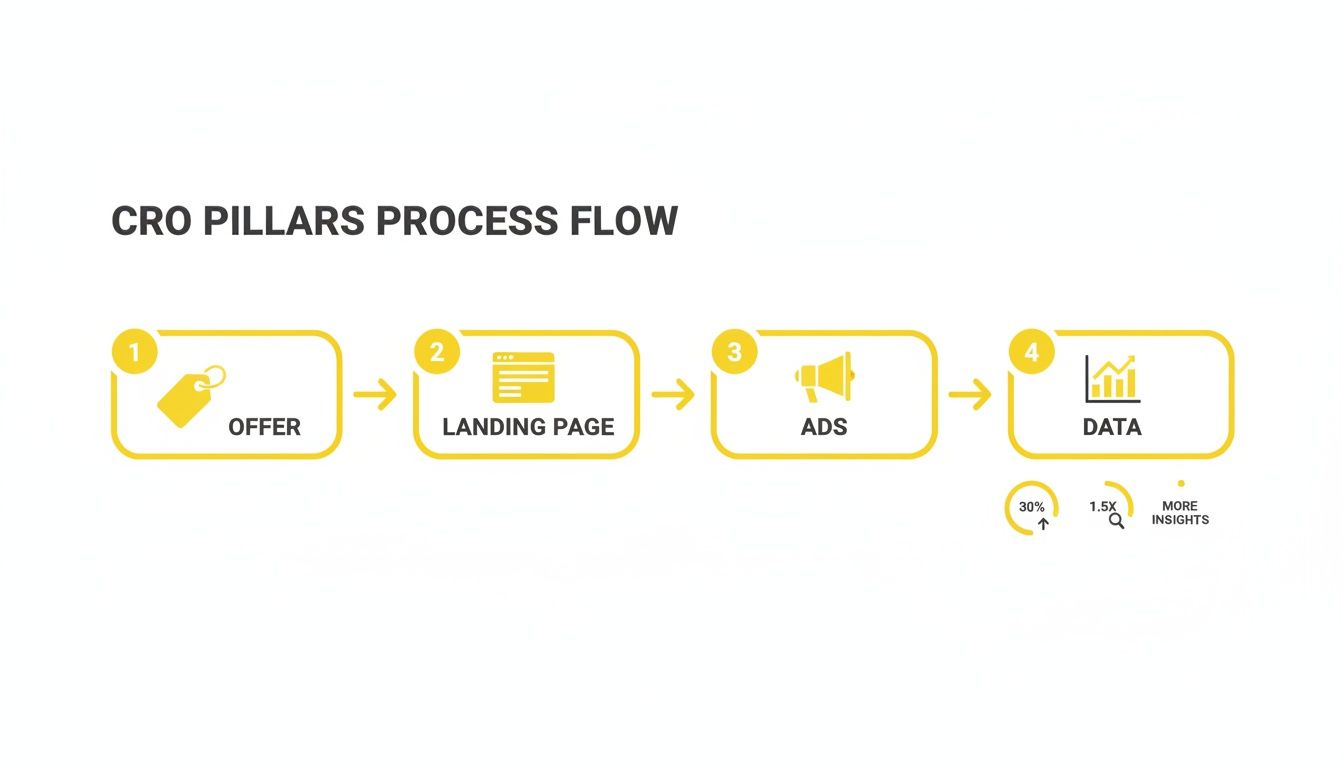
As you can see, a strong Offer is the base for everything. That leads to an optimized Landing Page, which is fed by targeted Ads, and the whole system is refined by Data.
The goal isn't just more clicks or traffic; it's to build a profitable, predictable system. When these four pillars are in sync, you move from guessing what works to knowing what drives results.
Conducting Your Pre-Flight Check
Start with a quick diagnostic of where you are right now. What's the most obvious weak spot?
If your ads get plenty of clicks but your bounce rate is through the roof, your landing page is probably the problem. If your page gets traffic but nobody buys, your offer might not be strong enough to get people to pull out their credit cards.
This initial audit helps you spot the low-hanging fruit so you can put your effort where it'll make the biggest difference, fast. For a deeper dive, check out a playbook on how to increase website conversions that shares some killer data-driven strategies.
Uncovering Your Website's Conversion Bottlenecks

If you want to genuinely increase your website's conversion rate, you have to stop guessing what’s wrong and start looking at the evidence. Put on your detective hat. Your website is leaving a trail of clues explaining why visitors aren't converting, and your job is to find them.
These clues, hidden right there in your website data, will show you the exact friction points stopping potential customers in their tracks. It’s the difference between fumbling around in the dark and making surgical, high-impact fixes.
This is the diagnostic phase, where raw data gets turned into a clear action plan. Instead of just wondering if your call-to-action is the problem, you’ll know.
From Numbers to Narratives with Analytics
Your first stop is always your analytics platform, probably Google Analytics. I know it can feel like a data firehose, but you’re only looking for specific patterns that tell a story about how people are using your site. The best way to do this is by setting up conversion funnels to visualize the customer journey from start to finish.
A typical e-commerce funnel might look something like this:
Viewed Product Page: A user shows some initial interest.
Added to Cart: They’ve decided they want the item.
Initiated Checkout: This is a strong sign of purchase intent.
Completed Purchase: The final conversion. Success!
By tracking the drop-off rate between each of these steps, you can pinpoint your biggest leaks. For instance, if 80% of users add a product to their cart but only 20% even start the checkout process, you've found a major bottleneck. That tells you the problem isn't the product itself—it's something happening in the cart experience.
Your goal isn't just to see what is happening, but to ask why. A huge drop-off on the shipping page points to cost or complexity issues. A high exit rate on a product page could mean the pricing or information is unclear.
Seeing Your Website Through Your Users' Eyes
Analytics tells you where the problem is, but you need other tools to see why it's happening. This is where behavioral analytics tools come in. They let you watch how real people actually interact with your site, giving you invaluable qualitative insights you can't get from numbers alone.
Two of the most powerful tools for this are:
Heatmaps: These give you a visual map of where users click, move their mouse, and how far down they scroll. If your most important CTA button is "cold" (getting no clicks) or it's buried in a section people never scroll to, that's an immediate, actionable insight.
Session Recordings: This is like looking over a user's shoulder. You can watch their entire visit, see their mouse movements, where they hesitate, and where they get stuck. Honestly, watching someone rage-click a broken button or abandon a confusing form is one of the fastest ways to build empathy and spot frustrating experiences.
I remember one e-commerce client had a solid funnel but a nagging cart abandonment issue. Session recordings showed us that a poorly designed discount code field on mobile was causing the phone's keyboard to cover the "Apply" button. Users couldn't use it, got frustrated, and left. Fixing that one tiny form field boosted their mobile conversion rate by 18% in a week.
The Most Common Conversion Bottlenecks to Investigate
Once you start digging into your data, you’ll begin to spot some familiar patterns. Focus your investigation on finding hard evidence of these common conversion killers.
Here’s a checklist to guide your detective work:
Confusing Navigation: Are users clicking back and forth between the same few pages, looking lost?
Unclear Value Proposition: Do heatmaps show that users are completely ignoring your headline and key benefit statements?
Hidden or Ineffective CTAs: Is your main call-to-action button sitting below the average scroll depth on your most important pages?
Form Friction: Do session recordings show users abandoning long, complicated, or confusing forms?
Slow Page Load Speed: Are users bouncing before your page even has a chance to load fully?
Unexpected Costs: Does your checkout funnel show a massive drop-off right on the shipping or tax calculation page?
When you combine the hard numbers from analytics with the human stories from behavioral tools, you get a complete picture. This data-backed list of specific problems becomes your roadmap for every optimization you make from here on out.
Building Irresistible Offers and Landing Pages

Alright, you've diagnosed the leaks in your website. Now for the fun part: plugging them with an offer so good people feel stupid saying no.
Think of it this way: your offer is the engine of your entire marketing campaign, and the landing page is the shiny, high-performance vehicle built around it. If that engine sputters—or the vehicle is missing wheels—your whole strategy grinds to a halt.
I've seen it countless times. A business will pour a fortune into ads and stunning design, but if the core offer is weak, it's like trying to sell a steak dinner to a vegan. It just won't work. Nailing this is the single most important step toward a better conversion rate.
Fortifying Your Core Offer
Let's get one thing straight: an offer is not just your product plus a price tag. It's the entire bundle of value you deliver. A truly irresistible offer dives deep into a customer's desires and crushes their biggest fears about buying.
The best ones I've seen are always built on these three pillars:
A Crystal-Clear Value Proposition: Can someone land on your page and, in five seconds flat, know exactly what you do and why it's for them? If not, you’ve already lost. Your core value needs to be front and center, screaming the primary benefit you deliver.
Risk Reversal: What’s the number one thing holding your customer back? What’s their biggest "what if?" Find it and kill it with a rock-solid guarantee. This could be a money-back promise, a satisfaction guarantee, or even a bold, results-based pledge. Your goal is to make saying "yes" feel like the safest, smartest decision they can make.
Urgency and Scarcity: People are professional procrastinators. Why should they buy right now? A limited-time bonus, a real inventory countdown, or an early-bird price gives them a compelling reason to act. Just be careful—fake scarcity is a surefire way to kill trust.
Key Takeaway: Your offer isn't just what you sell; it’s how you sell it. A strong guarantee can often be more persuasive than a discount because it builds confidence instead of just lowering the price.
Designing a Landing Page That Converts
Your landing page has exactly one job: sell the offer. That’s it.
This isn’t your homepage. It’s not the place for distracting navigation links, competing calls-to-action, or vague corporate fluff. Every single element—from the headline down to the final button—must work in harmony to guide the visitor toward one specific action. A great landing page is a masterclass in persuasive communication, anticipating questions and answering them in a logical flow that builds momentum with every scroll.
Essential Elements of a High-Converting Page
To build a page that turns clicks into customers, you absolutely need these core components. Each one plays a critical role in the user's journey.
A Benefit-Driven Headline: Your headline has to grab them by the collar. Instead of something bland like "High-Quality Coaching Services," hit them with a powerful outcome: "Double Your Leads in 90 Days—Guaranteed."
Compelling Social Proof: We trust other people more than we trust brands. Sprinkle in genuine testimonials, case studies with hard numbers, customer reviews, and logos from clients they'll recognize. Pro tip: Placing a powerful testimonial right next to a CTA button can work wonders.
Clear and Obvious Calls-to-Action (CTAs): Use action-oriented language. "Get Your Free Quote" is miles better than a lazy "Submit." Make your buttons pop with a contrasting color so they’re impossible to miss.
Benefit-Focused Copy: Stop listing features and start explaining how those features solve your customer's problems. A feature is what it is; a benefit is what it does for them.
Understanding average conversion rates helps set realistic goals. This table shows the significant variation across different e-commerce sectors, highlighting why a one-size-fits-all approach to CRO fails.
E-commerce Conversion Rate Benchmarks By Industry
Industry Category | Average Conversion Rate (%) |
|---|---|
Fashion and Apparel | 2.5% |
Health and Beauty | 3.2% |
Home Goods and Furniture | 1.4% |
Food and Beverage | 4.6% |
Electronics | 1.9% |
Sporting Goods | 2.1% |
Personal Care | 6.8% |
These numbers tell a story. While personal care products convert at an impressive 6.8%, home decor struggles at 1.4%. It's also interesting to see that desktop still wins at a 4.8% conversion rate compared to mobile's 2.9%, even though mobile drives a whopping 73% of all traffic. You can explore more e-commerce benchmarks to see where your industry stacks up.
A Practical Example of Offer and Page Synergy
Let's break this down with a real-world scenario. Imagine a real estate coach whose course sales are flatlining. Here’s how we’d rework the offer and the page.
Original Element | Improved Element | Why It Works Better |
|---|---|---|
Headline | "Learn Real Estate Investing" | "Get Your First Rental Property in 120 Days, Or Your Money Back" |
Guarantee | 30-Day Refund Policy | "The 120-Day Property Guarantee" |
Social Proof | A few written testimonials | Video testimonials from students standing in front of their new properties |
CTA | "Buy Now" | "Start Building Your Portfolio" |
See the difference? The original is generic and forgettable. The improved version is an irresistible package. It leads with a bold, specific promise, backs it up with an unbreakable guarantee that removes all risk, proves it works with compelling visual evidence, and closes with a CTA that taps directly into the user’s ultimate goal.
That synergy is how you stop leaking sales and start dramatically increasing your website conversion rate.
Executing a Strategic A/B Testing Plan

You’ve found the weak spots and beefed up your offer. Now it’s time to convert those insights into cold, hard cash. This is where a smart A/B testing plan separates the pros from the amateurs, taking you from educated guesses to data-backed decisions that actually move the needle.
Forget about tweaking button colors on a whim and hoping for a miracle. A real testing plan makes every experiment count. It’s the scientific method for your marketing, designed to deliver clear, actionable wins instead of just spinning your wheels.
This is how you stop throwing spaghetti at the wall and start making targeted changes designed to get a specific result.
Forming a Powerful Hypothesis
Every test worth running starts with a strong hypothesis. I'm not talking about a vague idea; I mean a clear, testable statement that predicts an outcome. The best ones follow a simple formula: "If I change [X], then [Y] will happen, because [Z]."
For instance, "Let's test a new headline" is a weak starting point. A powerful hypothesis sounds like this: "If we change our headline from focusing on product features to highlighting customer benefits, then lead form submissions will increase by 15%, because users will finally understand how our service solves their problem."
See the difference? This structure forces you to get crystal clear on three things:
The Change: What specific element are you actually modifying?
The Expected Outcome: What metric are you trying to improve?
The "Why": What’s the psychological reason or user behavior you think this will influence?
Prioritizing Your Tests for Maximum Impact
You can’t test everything at once, so you have to be smart about what you tackle first. I’m a big fan of the PIE framework—it’s a simple but incredibly effective way to prioritize: Potential, Importance, and Ease.
Potential: How much room for improvement is there? A checkout page with a 70% drop-off rate is a goldmine compared to an already optimized thank-you page.
Importance: How valuable is the traffic to this page? An experiment on your highest-traffic product page will give you meaningful data way faster than one on some obscure blog post from 2017.
Ease: How quickly can you get this test live? A headline change is a walk in the park. A complete checkout flow redesign is a major project.
Score each of your test ideas from 1 to 10 for each PIE category, then find the average. The ideas with the highest scores get top priority. This little exercise ensures you're always working on changes that deliver the biggest bang for your buck.
Your goal isn't just to find a "winner." It's to learn something valuable about your audience with every test you run, win or lose. A failed test that proves your assumption wrong is just as valuable as a win.
Understanding Statistical Significance
This is where so many marketers mess things up. A test result means nothing until it hits statistical significance. In plain English, that means you have at least a 95% confidence level that your results aren't just a random fluke.
The cardinal sin of A/B testing is ending a test too early. You might see one version pulling ahead after just a couple of days and be tempted to call it, but that's often just noise. Most A/B testing tools, like the old Google Optimize, Optimizely, or VWO, are built to tell you when you've collected enough data to make a confident call.
My rule of thumb? Let every test run for a full business cycle—at least one or two weeks. This smooths out any weird daily fluctuations in traffic or user behavior. Having that discipline prevents you from acting on false positives and ensures the lift you see is real.
Aligning Your Ad Strategy with Your Landing Page
You can have the most persuasive landing page on the planet and an offer that’s an absolute no-brainer, but if you're sending the wrong people to it, you're just lighting money on fire.
Think of your ad and your landing page as two halves of the same conversation. If they don’t connect, the whole thing feels jarring and confusing. For the user, it’s an immediate dead end.
This is where message match becomes one of the most critical levers you can pull to boost your conversion rate. It's really just a simple promise of consistency. What a user sees in your ad—the promise, the vibe, the visuals—must be what they get the second they land on your page.
When that journey is seamless, you build instant trust. The visitor feels understood and reassured they’re in the right place, which is a psychological win that has a massive impact on your bounce rate and, ultimately, your sales.
Crafting Ads That Pre-Qualify Visitors
Your ads have a much bigger job than just getting clicks. They need to get the right clicks. The goal is to attract your ideal customer and, just as important, to gently push away everyone else.
How do you do that? By being almost painfully specific in your ad copy and creative. Instead of casting a wide, vague net, your ad needs to act as a bouncer at the door of your landing page, setting crystal-clear expectations for who should enter.
For instance, a real estate coach shouldn't run an ad that just says, "Learn to Invest." It's way too broad. A killer, pre-qualifying ad would be something like, "Our Program Helps New Investors Buy Their First Multi-Family Property in 6 Months." This immediately filters out stock market gurus and seasoned flippers, attracting the exact person the landing page was built for.
Pro Tip: Never hide your price or commitment level if it’s a major part of the deal. An ad that says "Luxury Coaching for 7-Figure Entrepreneurs" pre-qualifies traffic infinitely better than one that just says "Business Coaching." You might get fewer clicks, but they'll be the ones that actually matter.
The Anatomy of a High-Converting Ad and Page Combo
Getting this alignment right goes deeper than just copy-pasting a headline. It's about creating a consistent vibe across the board—from the visuals and tone right down to the offer itself.
Let's break down how the key pieces should work together:
Headline Harmony: The headline of your ad and the main H1 title on your landing page need to be best friends. If your ad promises "Get 15% Off Your First Order," your landing page better greet visitors with that exact offer, front and center.
Visual Consistency: Use the same (or very similar) imagery and brand colors. If your ad features a specific person or product shot, that same visual should be the first thing people see on the landing page. It creates that "aha, I'm in the right spot" moment.
Offer Congruence: The deal itself—the product, the price, the guarantee—has to be identical. Any surprise, like an unexpected shipping fee or a different bonus, will instantly shatter trust and send people scrambling for the back button.
Real-World Scenario: Message Mismatch vs. Match
Let’s imagine a local med spa running a Facebook campaign for a new facial treatment. Here’s how this plays out in the real world.
Element | Poor Message Match (High Bounce Rate) | Strong Message Match (High Conversion Rate) |
|---|---|---|
Ad Headline | "Look Younger Today!" | "Get Our New HydraGlow Facial for $99" |
Ad Image | A generic stock photo of a woman | A video of a real esthetician performing the HydraGlow facial |
Landing Page | The spa's homepage with dozens of services | A dedicated page for the HydraGlow facial, with the "$99 Offer" in the headline |
The Result | Users land, get confused by all the options, can't find the facial they clicked for, and leave. | Users land, instantly see the offer they wanted, watch a demo of the service, and click "Book Now." |
The difference is night and day. The first example is a broken experience that forces the user to do all the work. The second is a frictionless path that guides a pre-qualified, motivated visitor straight to the finish line.
When you meticulously align every single ad with its landing page, you're not just tweaking your marketing—you’re fundamentally respecting the user’s intent. You're delivering on the promise you made the moment they clicked, and that synergy is non-negotiable if you want to see a real increase in your website's conversion rate.
Common Questions About Website Conversion Rates
Jumping into conversion rate optimization always kicks up a lot of questions. Getting straight answers is the only way to apply these strategies confidently and dodge the usual mistakes.
This section gets right to it, answering the most common questions I hear from business owners trying to figure out how to get more out of their website. Think of it as your no-fluff guide to the practical side of CRO.
What Is a Good Website Conversion Rate
This is always the first question, and the real answer is always, "It depends." You'll see people throw around an average website conversion rate of around 2.35%, but that number is pretty much meaningless without context. What's "good" changes dramatically depending on your industry, where your traffic is coming from, and your price point.
For instance, a low-cost e-commerce brand selling personal care products might hit a 6% conversion rate and consider that business as usual. On the other hand, a B2B company selling complex, high-ticket software might be thrilled with a 1% conversion rate—because every single sale is worth a small fortune.
Instead of getting hung up on some generic industry average, benchmark against the only number that matters: your own past performance. The real goal here isn’t to hit an arbitrary number but to create consistent, measurable improvement. A lift from 1.5% to 2.25% is a massive 50% increase in conversions, and that's a win you can take to the bank.
How Long Does It Take to See a Higher Conversion Rate
How quickly you see results boils down to two things: how big of a change you make and how much traffic your site gets.
A simple, high-impact fix on a page that gets thousands of visitors a day—like clarifying a confusing offer or fixing a broken checkout button—can show a noticeable lift in just a few days. The feedback is almost instant.
But a proper A/B test demands patience. You have to let it run long enough to reach statistical significance (usually a 95% confidence level) so you know for sure the results aren't just a random fluke. For most sites, this means running a test for at least one to two full weeks to even out the natural ups and downs of daily user behavior.
Should I Optimize for Mobile or Desktop First
The answer is sitting right there in your analytics. While desktop users often convert at a higher rate (averaging 4.8% versus mobile's 2.9%), mobile is usually where the party's at, driving the lion's share of traffic—sometimes over 70%.
The biggest opportunity is almost always where you find a big gap between traffic share and conversion share.
Jump into your Google Analytics: Head over to the Audience > Mobile > Overview report.
Look at the numbers: If you see that mobile brings in 75% of your visitors but only drives 40% of your sales, you've just found your top priority.
For most businesses I see today, starting with the mobile experience is the smartest play. You’re fixing the journey for the biggest chunk of your audience, and that's where the most potential for growth is hiding.
What Are the Most Common Conversion Killers
Every website has its own unique problems, but a handful of usual suspects are behind most lost sales and leads. Taking care of these fundamental issues is often the fastest way to get a big lift in your conversion rate.
Keep an eye out for these troublemakers:
Slow Page Load Speed: If your site takes more than three seconds to load, a huge chunk of your visitors have already bailed.
A Weak or Confusing Offer: People land on your page and can't immediately figure out what you're selling or why it's a great deal for them.
A Complicated Checkout Process: Too many steps, pointless form fields, or surprise shipping costs are notorious for killing sales right at the finish line.
Lack of Trust Signals: No reviews, security badges, clear contact info, or a strong guarantee? People get nervous and won't pull out their wallets.
Poor Message Match: The ad promises one thing, but the landing page delivers something completely different. This creates instant confusion and kills momentum.
Ready to stop guessing and start getting predictable, profitable results from your ads? At Wojo Media, we specialize in building omnipresent campaigns that turn clicks into customers. We'll help you refine your offer, build high-converting landing pages, and scale your ads with a data-driven strategy. Book a free demo call with us today and get a custom plan to increase your website's conversion rate.
Comments