.png)
Optimize Landing Pages for Conversions: Proven Tactics to Boost Conversions
- Jason Wojo
- Feb 14
- 16 min read

It’s a painful feeling. You’re pumping money into ads, getting clicks, and then… nothing. The visitors just vanish. When you finally get serious about optimizing your landing pages for conversions, you’re doing more than just changing a button color. You’re building a machine that reliably turns your ad spend into predictable growth by finally syncing up your message, design, and offer with what your visitors actually want.
Why Your Landing Page Is Losing You Money

Let's be blunt: if your landing page isn't converting, it’s a hole in your pocket. Every single click that doesn’t lead to a sale or a lead is wasted ad spend. It's a missed opportunity staring you in the face.
Nine times out of ten, the problem isn't your product or service. The real issue is the experience you deliver in those critical first few seconds after someone clicks your ad.
Most pages that fall flat do so because of a fundamental disconnect. They hit visitors with a confusing message, offer zero clear direction, or push an offer that just doesn't solve the visitor's immediate problem. This guide is about moving past the guesswork. It's a proven framework for finding these weak spots and implementing fixes that actually work.
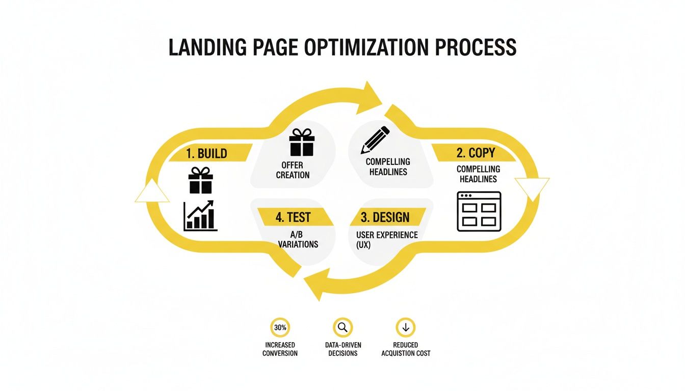
The Core Pillars of Conversion
To fix this, we focus our energy on four essential pillars. Each one tackles a crucial part of the user's journey. When you get them all working together, you create a powerful, high-converting experience that feels effortless for the visitor.
Below is a quick breakdown of how we approach this. Each pillar builds on the last, creating a solid foundation for growth.
Landing Page Optimization Pillar Breakdown
Pillar | Objective | Key Action |
|---|---|---|
Compelling Offer | Solve a specific pain point so well that the visitor can't say no. | Craft an irresistible value proposition and communicate it clearly. |
Persuasive Copy | Guide the visitor from interest to action using clear, confident language. | Connect with their emotions and logic through benefit-driven writing. |
User-Centric Design | Make the conversion process feel intuitive and frictionless. | Use visual hierarchy and clean layouts to remove any confusion. |
Data-Driven Testing | Base decisions on real user behavior, not just assumptions. | Continuously run A/B tests to find what truly moves the needle. |
Each of these pillars is a lever you can pull to dramatically improve your results. It's not about a single magic bullet, but a systematic approach to improvement.
Think of your landing page less like a digital brochure and more like a focused sales conversation. Its only job is to convince a visitor to take one specific action. Everything on that page—every word, every image—must serve that single goal.
Knowing where you stand is the first step. The median conversion rate across thousands of landing pages is a modest 6.6%, but the top players in fields like financial services can pull in over 24%. A huge difference-maker is volume and focus; businesses with 31-40 optimized landing pages generate seven times more leads than those with just one or two.
Ultimately, a leaky landing page damages your entire business, from customer acquisition cost all the way to long-term profitability. And the leaks don't stop at the first conversion. An effective dunning process is also vital for recovering failed payments and keeping customers, plugging another common hole where your funnel loses money to churn.
Nailing the Headline and Offer
Your headline is the first thing a visitor sees, and you've got about three seconds to convince them to stick around. If it doesn't immediately grab them by the collar and scream "this is the solution you've been looking for," they're gone. A great headline isn't just a clever turn of phrase; it's a direct promise that you're about to solve their problem.
Think of it like this: the ad they clicked is a promise. Your landing page headline is the confirmation. This is called message match, and it's non-negotiable. If your Facebook ad screams "50% Off Custom Dog Beds," your headline better not whisper "Beautiful Pet Furniture." That disconnect shatters trust instantly. A perfect match tells them they're in the right place, which is the first step to slashing your bounce rate.
Stop Writing Vague Headlines
Nobody is searching for "The Best Marketing Solution" or "Grow Your Business." Those phrases are empty calories—they sound good but offer zero substance. Your headline needs to promise a tangible outcome, a specific benefit that resonates with the reader's real-world desires.
Let’s get practical.
Vague: "High-Quality Protein Powder"
Benefit-Driven: "Build Lean Muscle Without the Bloat"
See the difference? The second one hits on a key desire (lean muscle) and a common frustration (bloating). It’s not about what your product is. It's about what it does for your customer. Getting this right is the foundation of a high-converting page.
Your headline’s only job is to sell the next sentence. If it fails, the rest of your beautifully designed page is invisible.
The Psychology of an Offer They Can't Refuse
The offer is the heart of your page. It’s the deal. It's the "what's in it for me?" A weak offer will kill a great headline every single time. The secret to an irresistible offer lies in three things: high perceived value, low perceived risk, and a believable reason to act now.
First, stack the value so high it feels like a steal. Value isn't just about price; it's about everything they get.
For an e-commerce brand, it looks like this:
The Product: A leather wallet.
The Offer: A handcrafted leather wallet + a free matching keychain + a guide on caring for leather + free 2-day shipping.
You're no longer just selling a wallet. You're selling a complete experience.
Erase Their Doubts and Light a Fire
Every potential customer has a voice of doubt in their head. "What if I hate it?" "What if it doesn't work?" "Is this even a real company?" Your job is to silence that voice with a rock-solid guarantee.
Which of these feels safer?
Standard: "30-Day Money-Back Guarantee"
Better: "The 'You'll Love It' 60-Day Guarantee: If you don't think it's the best wallet you've ever owned, we'll refund you in full… and you can keep it."
The second one radiates confidence. It removes every last bit of risk for the buyer, making the decision to purchase a no-brainer.
Finally, you have to create real urgency. People are professional procrastinators. Without a nudge, "later" becomes "never." But fake countdown timers and generic "Limited Time Offer!" slogans just feel sleazy. The urgency has to be tied to something real.
For a local plumber, this works wonders:
Weak Urgency: "Call Today!"
Strong Urgency: "We only have 3 spots left for new clients this month. Book your consultation to claim yours."
This frames your service as exclusive and in-demand, not desperate. When you combine a headline that speaks to their soul with an offer that feels like a home run, you create a powerful combination that turns passive scrollers into immediate customers.
Designing for a Frictionless User Journey
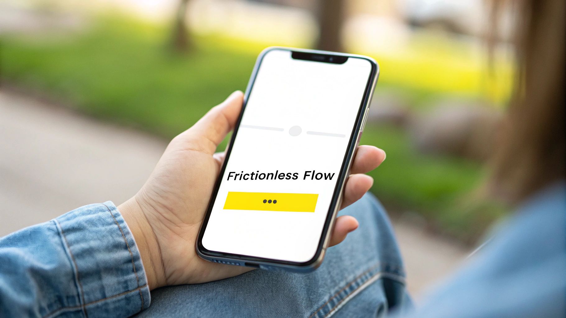
While a killer headline and offer get people to stick around, it's the design and user experience that actually get them to convert. Great design isn’t about winning awards or using flashy graphics. It's the invisible hand that gently guides a user toward your call to action, making the entire journey feel obvious and effortless.
Think of it this way: every single element on your page should serve one purpose—to make converting easier. That means getting rid of anything that could cause even a flicker of hesitation or confusion. A clean, focused layout is your secret weapon here.
Prioritizing Visual Hierarchy and Flow
Visual hierarchy is just a fancy way of saying you’re telling a user’s eyes where to look first, second, and third. You pull this off by strategically using size, color, and placement to make the most important stuff jump off the page.
Your headline should be the biggest, boldest text. Your call-to-action (CTA) button needs to pop with a contrasting color. All the supporting details can be smaller. This creates a natural, smooth visual path that leads right where you want them to go: the conversion goal.
And don’t forget whitespace. It’s not just empty space; it’s an active design element that gives your content room to breathe. It cuts down on cognitive load, makes your page easier to read, and helps your key elements stand out. A crowded page just feels chaotic and sends visitors running for the back button.
The Power of a Single Focused Goal
One of the single most effective things you can do to optimize landing pages for conversions is to eliminate every possible distraction. Your landing page has one job. Any link that doesn’t contribute to that job is a potential exit ramp for your visitor. This is why removing your main website navigation is an absolute non-negotiable.
I know it feels weird to remove links back to your main site, but the data is overwhelming. Stripping the navigation from a landing page has been shown to double conversions, with some studies showing a lift of up to 100%. Pages with a single goal and zero distracting links just flat-out convert better than those with five or more. Why? Because when you give people one clear path, they’re far more likely to take it. You can dig into more of these landing page statistics on Marketing LTB.
Your landing page is not your website. It’s a specialized tool built for a single purpose. Treat it that way by ruthlessly cutting out anything that doesn’t directly support its one and only goal.
Building Instant Trust with Visual Cues
Before anyone gives you their email or credit card number, they need to trust you. That trust is built in seconds through a series of subtle visual signals that scream credibility and authenticity.
One of the most potent trust signals is a human face. Our brains are hardwired to connect with other people. Using a high-quality, authentic photo of a real person in your hero section can instantly make your brand feel more relatable and trustworthy. In fact, an analysis of top-performing pages found that 73% use human faces to grab attention and build that immediate connection.
Social proof is the other side of that coin. We’ll get into the copy later, but how you design your social proof is critical. Here’s how to place it for maximum impact:
Customer Logos: Slap a bar of well-known client logos "above the fold" to borrow their authority right away.
Testimonials: Don't just post a quote. Pair it with the customer's photo and name, and place it near your CTA to squash any last-minute doubts.
Trust Badges: Display security seals (like SSL certificates) or industry awards right next to your form fields. This reassures users their data is safe at the exact moment they might be feeling hesitant.
Designing for the Mobile-First Reality
Finally, your design has to be absolutely flawless on a phone. The vast majority of ad traffic now comes from mobile devices, so a clunky mobile experience is a guaranteed conversion killer. And this goes way beyond just having a "responsive" layout.
A true mobile-first design understands the user's context. They're probably on the go, scrolling with their thumb.
Stick to these mobile-first principles:
Large, Tappable Buttons: Make sure your CTA buttons are big enough to be easily tapped with a thumb without accidentally hitting something else.
Simple Forms: Keep forms as short as humanly possible. Use single-column layouts and enable autofill options wherever you can.
Readable Fonts: Use a clean, legible font size. No one wants to pinch and zoom just to read what you're offering.
Fast Load Times: Optimize every image and line of code. Mobile users are impatient, and every second of load time sends your bounce rate soaring.
When you blend a clear visual hierarchy with powerful trust signals and a perfect mobile experience, you create a path of least resistance. You make converting feel like the most natural next step in the world.
Writing Copy That Persuades and Sells

If your headline and design are the curb appeal that gets visitors to stop and look, your copy is the expert salesperson who invites them inside and closes the deal. The words on your page do the heavy lifting, guiding someone from casual curiosity to confident commitment.
Your copy needs to do more than just list what you sell. It has to connect with a problem your visitor is actively trying to solve, showing them you truly get it.
There's a classic formula for this because it just works: identify a pain point, agitate it by showing what happens if they do nothing, and then present your offer as the clear, obvious solution. This isn't about being manipulative; it's about empathy. You're showing them you understand their struggle on a deep level.
Start by painting a clear picture of their frustration using the exact language they would use. Then, gently twist the knife. What are the real consequences of this problem going unsolved? Finally, bring in your product as the hero—the only logical path to relief.
From Features to Benefits
One of the biggest mistakes I see people make is rambling on about features instead of spelling out the benefits. Here’s the deal: nobody buys a drill because they want a drill. They buy it because they want a hole in the wall. Your copy needs to connect those dots for them.
A feature is what your product is or does. A benefit is what the customer gets or feels as a result.
The easiest way to get from a feature to a benefit is to ask yourself, "So what?"
Feature: Our protein powder has 25g of whey isolate. (So what?)
Benefit: So you can build lean muscle faster without the stomach-churning bloat you get from cheaper powders.
Feature: This software has a drag-and-drop interface. (So what?)
Benefit: So you can build a professional-looking website in an afternoon, even if you have zero coding experience.
When you nail down your benefits, lay them out in punchy, action-oriented bullet points. They break up walls of text and make the value you offer immediately scannable. Think of each bullet point as a mini-headline selling a specific, desirable outcome.
Crafting a Call to Action That Works
Your Call to Action (CTA) is arguably the most important piece of copy on the entire page. It's the final instruction, the moment of truth. Vague, lazy CTAs like "Submit" or "Click Here" are conversion killers. They create uncertainty and friction right when you need clarity and momentum.
A great CTA is specific, highlights a benefit, and feels low-risk. It tells the user exactly what happens next and reminds them of the value they're about to get.
Just look at the difference:
Weak CTA | Strong, Compelling CTA |
|---|---|
Submit | Get My Free Marketing Plan |
Sign Up | Start My 30-Day Free Trial |
Buy Now | Yes, I Want to Save 50% |
Notice how the stronger versions often use first-person language ("My," "I") and focus on the gain. The goal is to make clicking that button feel like an empowering choice, not just another task.
The perfect CTA completes the sentence, "I want to..." If your button text fits naturally after that phrase, you're on the right track.
The Power of Personalization
If you want to truly optimize landing pages for conversions, personalization is your secret weapon. This is way more than just sticking a visitor's name at the top of the page. It’s about tailoring the entire message—from the headline down to the CTA—to their specific needs and how they found you.
For instance, someone who clicks a Facebook ad about "wedding photography" should land on a page with a different CTA than someone who came from a Google search for "corporate headshots." That level of relevance makes the visitor feel seen and understood.
The data on this is impossible to ignore. Personalized CTAs have been shown to convert a massive 202% better than generic ones. Dynamic pages that adapt to the visitor see a 25.2% higher conversion rate on mobile—a huge deal when mobile traffic often accounts for over 82% of visits. When you directly address visitor anxieties in your copy, you can see an 80% lift. You can dig into more of these stats over at Meetanshi.com's landing page statistics roundup.
When you weave persuasive, benefit-first language through your page and cap it off with a specific, compelling CTA, converting feels like the most natural next step in the world for your visitor.
Building Your Data-Driven Testing System
So far, we’ve walked through the essentials of a landing page that converts—a killer offer, copy that sells, and a design that makes it easy for people to say yes. But here’s the unvarnished truth: even the most well-designed page is still just a collection of your best-educated guesses.
The only way to turn those guesses into bankable results is to stop assuming and start testing. This is where the rubber meets the road.
A systematic testing process is the engine that powers relentless improvement. It lets you fine-tune your pages based on what real people actually do, not what you think they'll do. Without it, you’re just flying blind, burning through ad spend on changes that might do nothing—or worse, tank your conversion rates.
Forming a Strong Hypothesis
Every test that’s worth running starts with a solid hypothesis. This isn't just a random thought like, "Maybe a green button would work better?" A proper hypothesis is a clear, testable statement connecting a specific change to an expected outcome, backed by a logical reason.
It follows a simple but powerful framework: "If I [make this specific change], then [this specific outcome will happen], because [this psychological reason]."
Let's see what this looks like in the real world:
For a local med spa: "If we change the headline from 'Book a Consultation' to 'Get Your Personalized Anti-Aging Plan,' then we will get more form submissions because the new headline focuses on a desirable outcome rather than a generic action."
For an e-commerce store: "If we replace the polished product photos with user-generated content (UGC) on the landing page, then our add-to-cart rate will increase because the authentic images build more trust and social proof."
A strong hypothesis forces you to be strategic. It makes you think critically about why a change might work, which makes your wins repeatable instead of just lucky.
Identifying High-Impact Elements to Test
It’s tempting to get bogged down testing tiny details like button colors or font sizes. While those things can make a small difference, they rarely deliver the kind of results that move the needle. To get the biggest bang for your buck, you have to start with the elements that have the most influence on a visitor's decision.
Your testing roadmap should prioritize the big swings—the changes that fundamentally alter how a user sees your offer.
The Hierarchy of Testing Impact:
The Offer: This is your biggest lever, period. Test different guarantees, product bundles, pricing, or free trial structures. A small tweak to the offer itself can lead to massive jumps in conversions.
The Headline: It’s the first thing people read, and it has an outsized impact on whether they stick around. Pit a benefit-driven headline against a problem-focused one and see what resonates.
Page Layout and Flow: Radical changes can dramatically reduce friction. Think about moving your form above the fold or switching from a multi-column to a single-column layout.
Media: Test your hero image or video. A candid shot of a real customer using your product might absolutely destroy a generic stock photo.
Body Copy and CTA: Once the bigger pieces are dialed in, you can start refining the persuasive language and call-to-action text for smaller, incremental improvements.
Stop wasting time on low-impact tests. Changing your button from red to green might give you a 1% lift if you're lucky. Changing your offer from a "Free Trial" to a "Done-For-You Demo" could double your business. Focus on the big swings first.
Understanding and Reaching Statistical Significance
Starting a test is easy. Knowing when to stop it is what separates the pros from the amateurs. You can't just run an A/B test for 24 hours, see that Version B got two more sign-ups, and declare it the winner. That’s just statistical noise.
You need to reach statistical significance, which is just a mathematical way of saying you’re confident your results aren't a fluke. Most testing tools will calculate this for you, but you should always aim for a confidence level of 95% or higher.
This means you’re 95% certain that the winning version will keep outperforming the other one over the long haul. Getting there requires enough traffic and conversions to make the data reliable.
One of the most common and costly mistakes is calling a test too early. It leads you to make business decisions based on faulty data, which is far worse than having no data at all. A disciplined testing system, on the other hand, gives you the confidence to scale your ad spend, knowing your landing page is a finely-tuned conversion machine.
So, What's Your Game Plan?
You've got the complete playbook now. It's time to stop guessing and start winning. Real success with landing pages isn't about some magic bullet or a single secret trick; it's about having a proven process and sticking to it. If you want to really optimize your pages for conversions, you have to treat it like a cycle: you implement smart changes, look at the data, and then you iterate.
The pillars we've walked through are your foundation for predictable, scalable growth. It all starts with a genuinely compelling offer that you communicate through persuasive, benefit-first copy. That message then gets delivered through a clean, user-focused design that ruthlessly cuts out any friction standing between your visitor and the "submit" button. Finally, a solid testing framework is what turns your gut feelings into hard certainties.
Landing page optimization is the shift from hoping for results to systematically creating them. It's about building a reliable engine that turns ad spend into profitable growth, one test at a time.
This is how you get away from inconsistent, up-and-down results and build a dependable conversion machine. For anyone in the B2B world, these principles are absolutely critical for pulling in qualified leads. If you want to go even deeper on that topic, this comprehensive B2B landing pages guide is a fantastic resource.
Now, it's your turn. Take these strategies and put them to work in your business.
Frequently Asked Questions
Even when you've got a solid strategy, a few common questions always seem to pop up once you get serious about optimizing landing pages for conversions. Let's tackle some of the biggest sticking points I see all the time.
This whole process is a cycle. You don't just set it and forget it.
It’s a constant loop of building, writing copy, tweaking the design, and testing everything to see what works. That’s how you get sustained improvement, not just a one-time bump.
How Long Should a Landing Page Be?
There’s no magic number here. The right length depends entirely on your offer's price and complexity.
If you’re offering something simple and free, like a PDF download, keep it short and punchy. The user doesn’t need much convincing, so get straight to the point and cut the friction.
But if you’re asking for a real commitment—like buying a high-ticket course or signing up for a premium service—you’ll need more runway. Longer copy almost always performs better here because you have to build trust, handle objections, and spell out the value. The bigger the ask, the more proof you need to provide.
Should I Remove Navigation from My Landing Page?
Yes. 100% yes. This is one of the fastest and highest-impact changes you can make.
A good landing page has a single, focused goal. Your website's main navigation menu is a massive distraction, offering dozens of "exit ramps" that lead visitors away from the one action you want them to take.
When you remove the navigation, you trap your visitor (in a good way!) and force them to focus on the offer. I’ve seen this one tweak alone double conversion rates. It’s that powerful.
Think of it this way: You paid to get that person to your landing page for one specific reason. Don't hand them an easy escape route. Keep their eyes on the prize—your call to action.
How Many Form Fields Should I Use?
As few as humanly possible. Seriously. Every single field you add is another reason for someone to give up and leave.
For a top-of-funnel offer like a newsletter or a free guide, an email address is usually all you really need. If you need more info to qualify leads, get it later. Ask for it in a follow-up email or on the thank you page.
Be ruthless. Ask yourself if each field is a "need-to-have" or just a "nice-to-have." If it’s the latter, get rid of it.
At Wojo Media, we don’t just build ads; we build the high-converting landing pages that turn those ads into predictable revenue. Book a call with us to see how we can optimize your entire funnel for profitable growth.
Comments